ComboLab
A community learning experience for all fighting gamers.
Role: UI/UX Designer, Product Designer
Project Overview
Background
Fighting games have been going through a significant resurgence in popular gaming culture in recent years. With many titles being released and influencer events being hosted, a new generation of gamers around the world are being drawn towards fighting games for the first time.
For this project, I aimed to provide beginner fighting game players a better learning experience and to bring together all players new and old through a community-driven combo sharing platform
Problem
Fighting games are often considered some of the hardest video games to learn as a new player. Since the genre began really early in video game history, many titles have decades-old bloated systems and mechanics without proper tutorials. New players often struggle to find adequate resources online in order to learn and properly acclimate into the fighting game community.
Fighting game players of all skill levels, typically ages 16-35.
Target Users
Scope
The project focuses on identifying user needs based on gaps in the market and building an experience that will best serve players and the fighting game community. While all pages within the app were planned, only the screens through the main user flow were fully designed due to time constraints.
Coding/implementation of the app was outside the scope of this project.
Solution
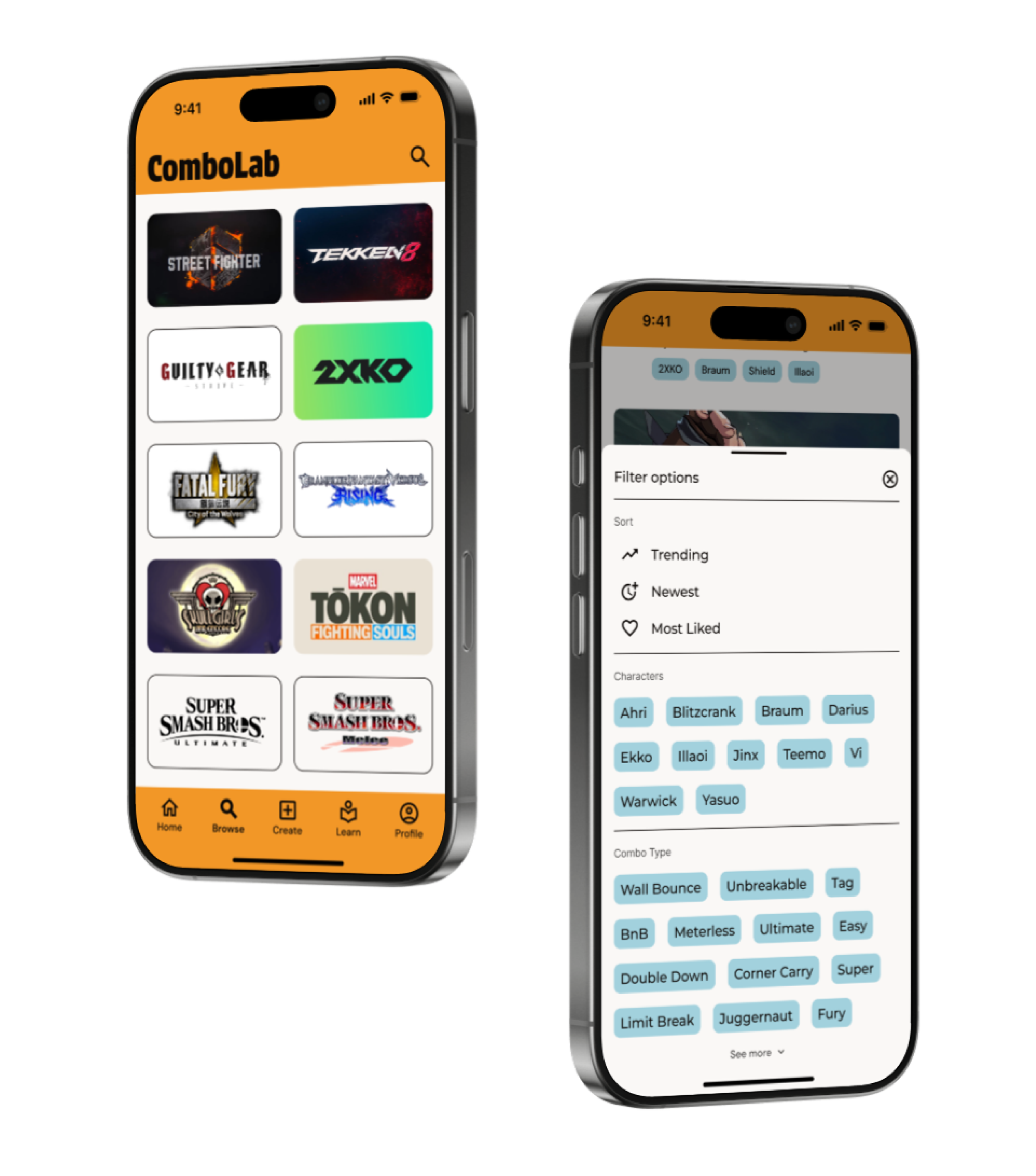
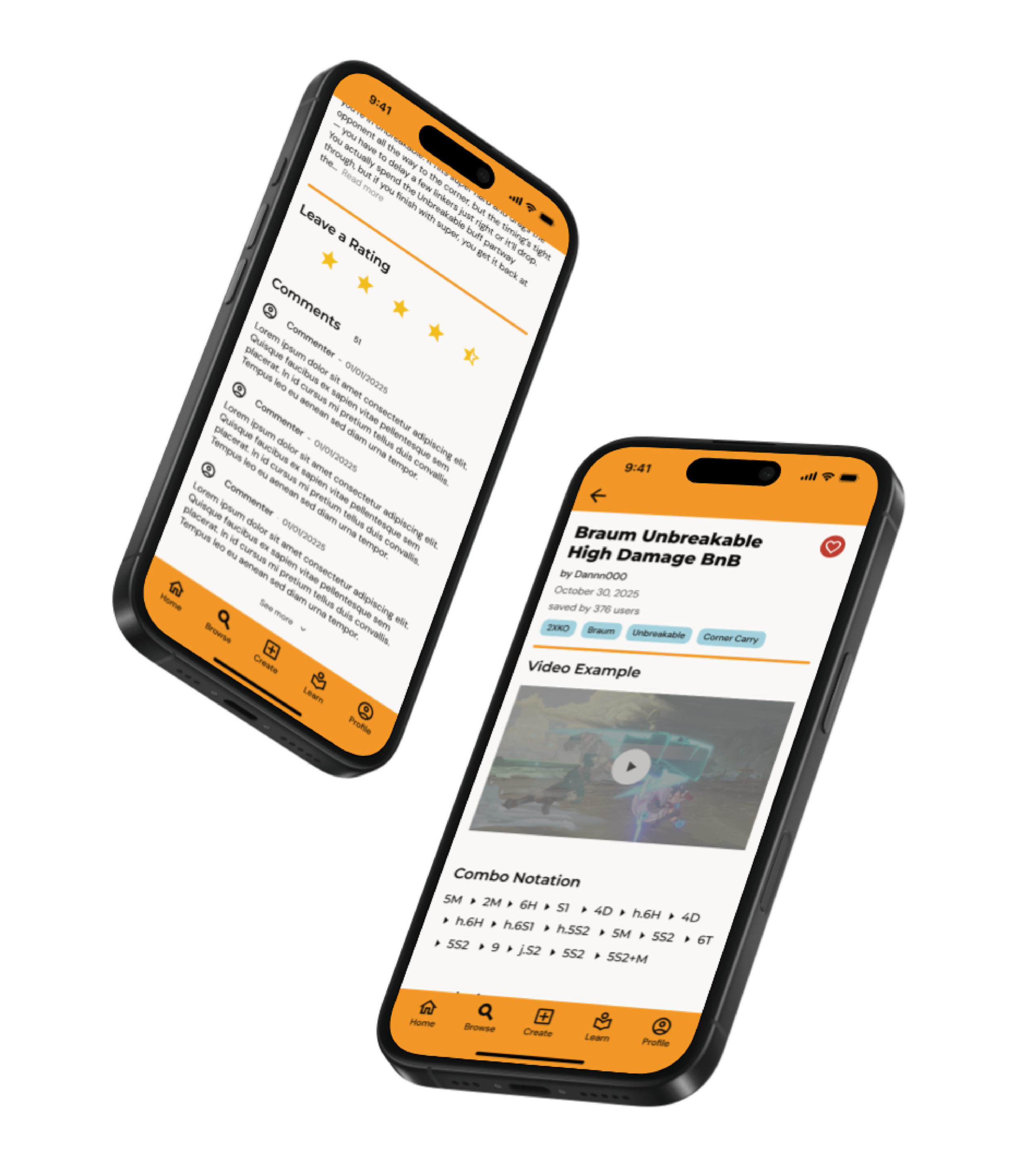
I designed a mobile app that allows fighting game players to share and discover combos across a variety of fighting games. The app is community-focused, providing a hub where players of all levels can not only learn new techniques, grow as players, and connect with others.
Research
Competitive Audit
To better understand how existing services are addressing the needs of fighting game players, I conducted some competitor research of the five most popular competitors. I examined each app or service and identified their main strengths and weaknesses, focusing on the features, usability, and community support.
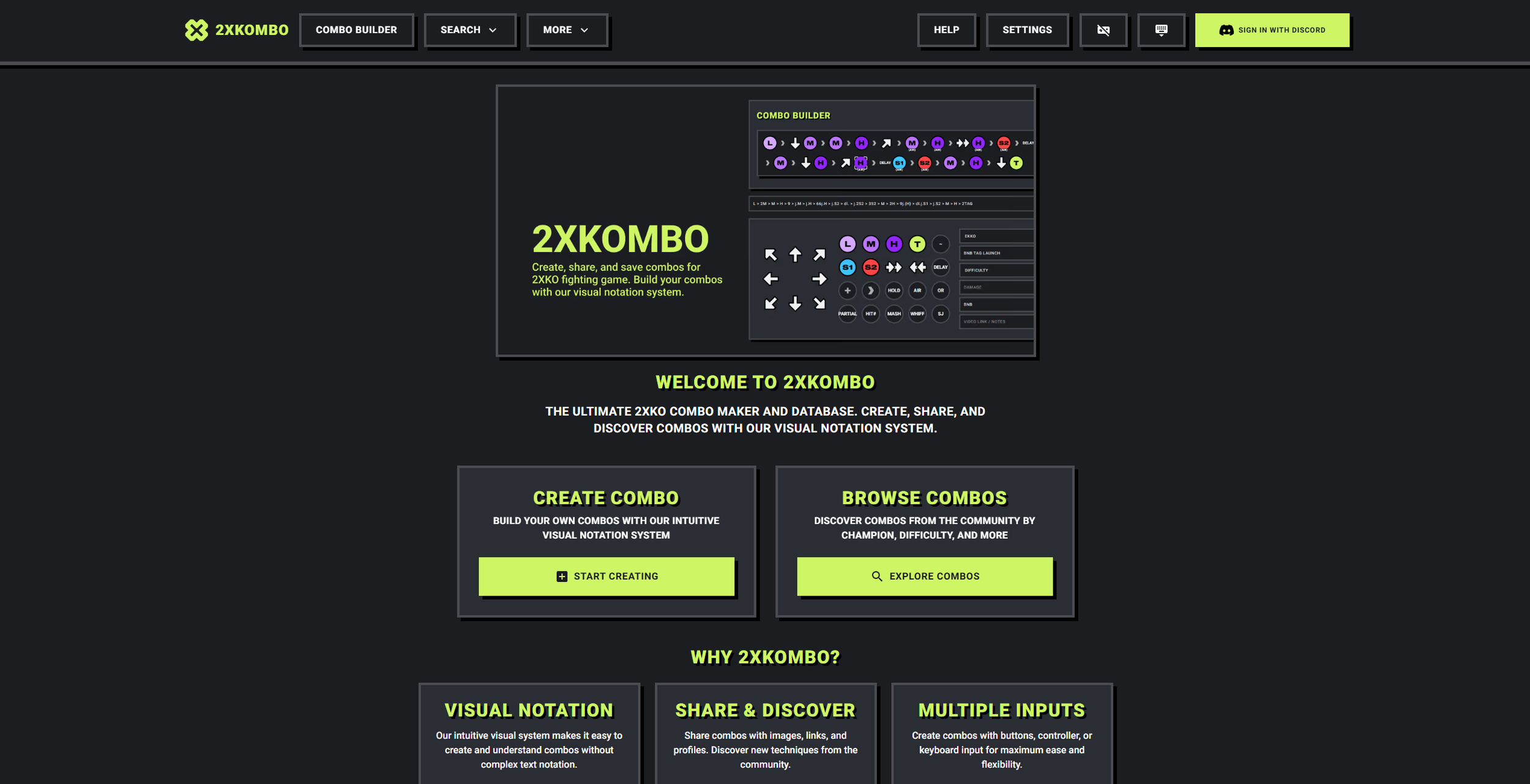
(2XKOMBO)
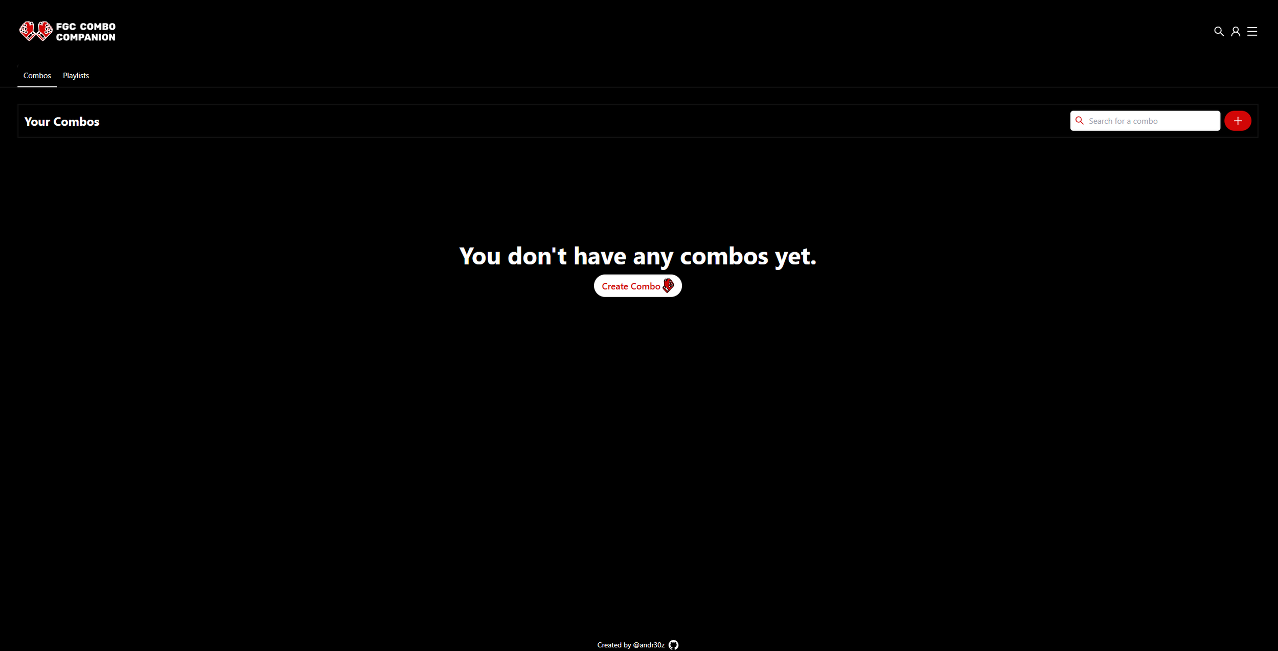
(FGC Combo Companion)
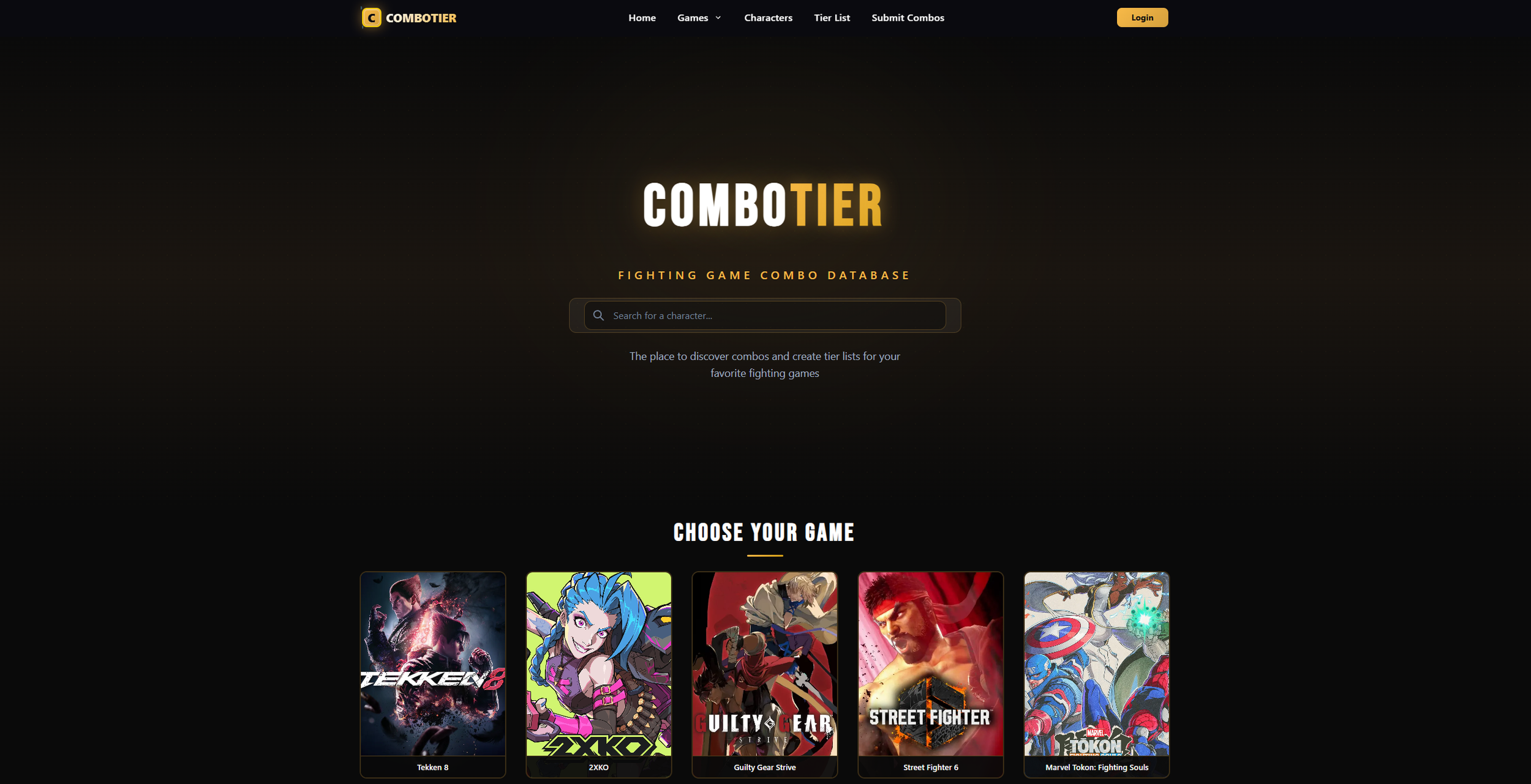
(ComboTier)
Market research shows that despite several apps and websites already providing combo database/creation tools, most are either game-specific, lack community features, or have outdated UI/UX. As such, in order to differentiate ourselves from the existing market, we should focus on:
cross-game support,
community-driven platform with social interactions, and
intuitive and modern combo creation and discovery features.
User Research
Next, I conducted conducted secondary user research by examining online forums, discussion threads, and community posts in order to find out how fighting game players currently learn combos. In particular, I focused my search on beginner players, how they approached learning, what challenges they faced, and whether they are engaging with online combo resources and tools.
“The games provide move lists, but they do not provide combo lists … figuring them out on my own is hard.” - maniaxe613, GameFAQs
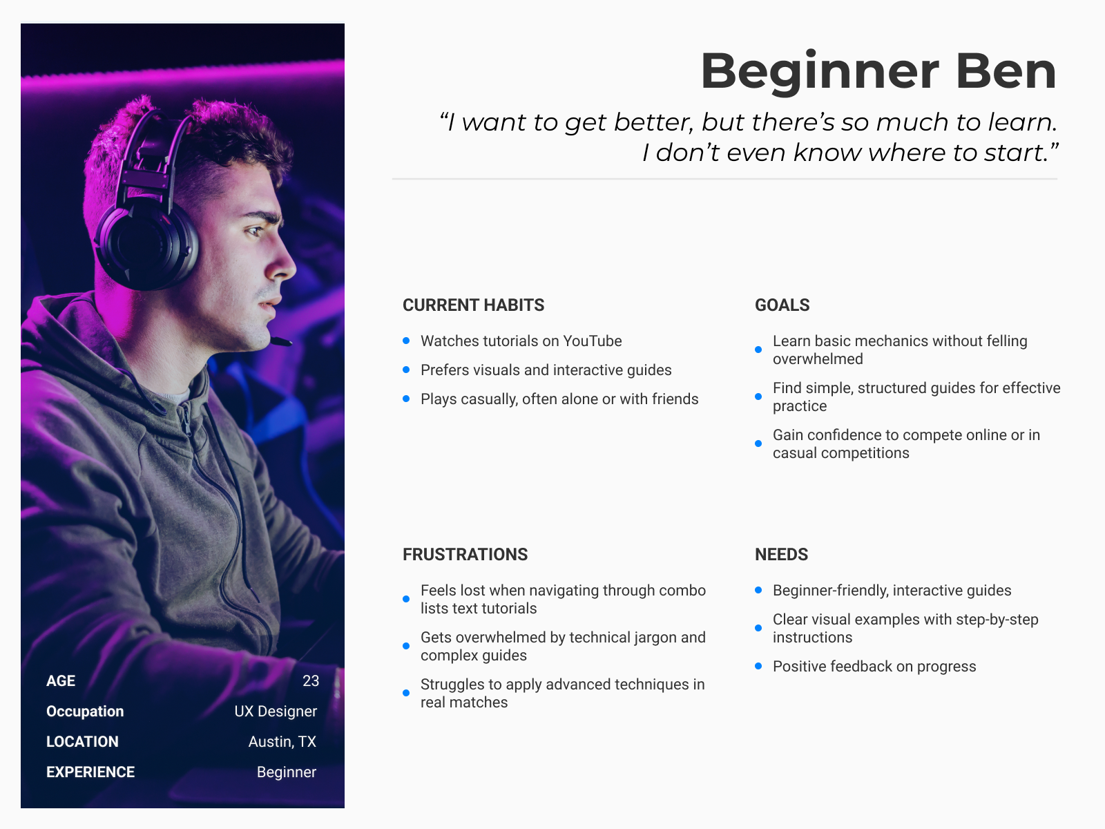
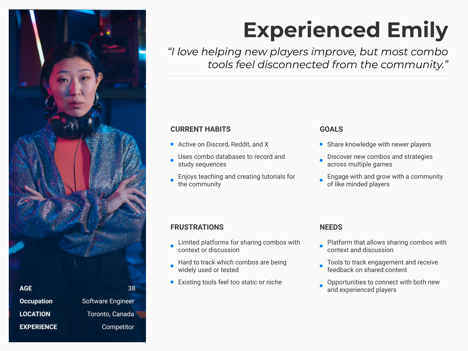
User Personas
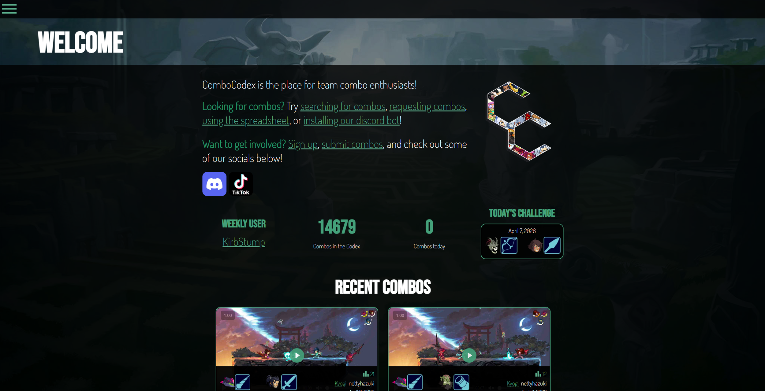
(ComboCodex)
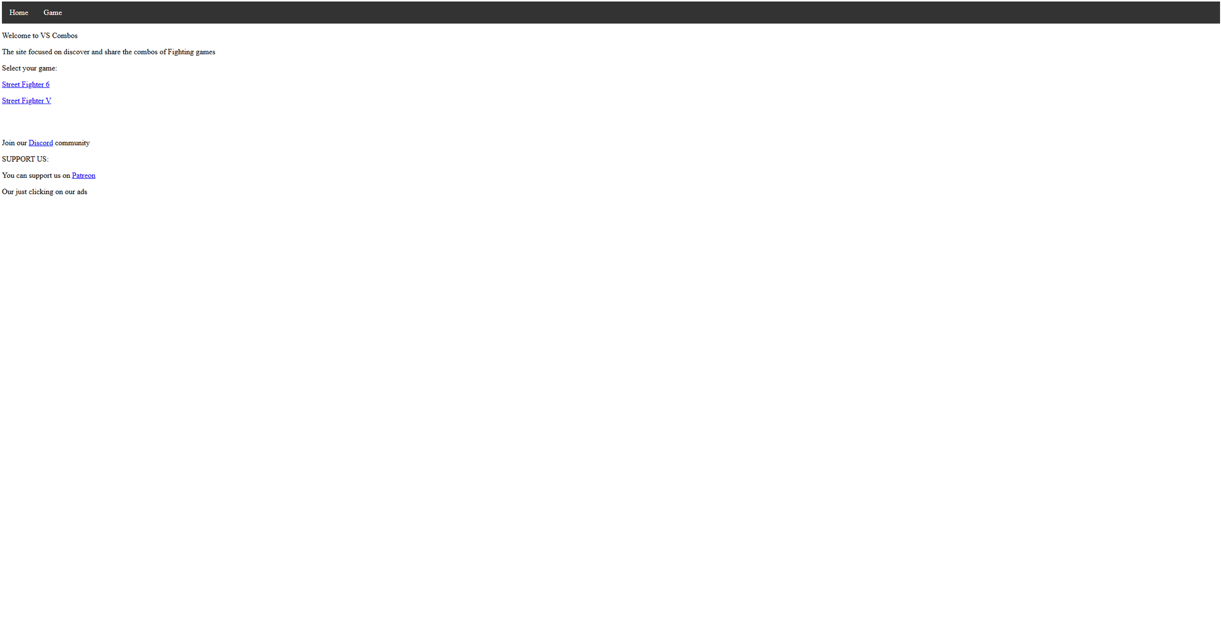
(VS Combos)
“I feel overwhelmed by all the inputs and combos at first - it’s hard to even know where to start.” - Reptylus, Reddit
“I’m still quite new to fighters but feel like I’m stuck at a wall … I can never pilot a character in such a way that matches my inner decision‑making.” - Castle_Corgbenic, Reddit
“I’ve been doing the combo trial stuff but I don’t know what to focus on and what to throw away.” - headies1, Reddit
Based on insights from both the market analysis and the user research, I developed two user personas to represent groups of users in my target audience. Together, these personas highlight the needs, goals, and frustrations of both user groups, helping me make research-based decisions throughout the rest of the design process.
Ideation
User Flows
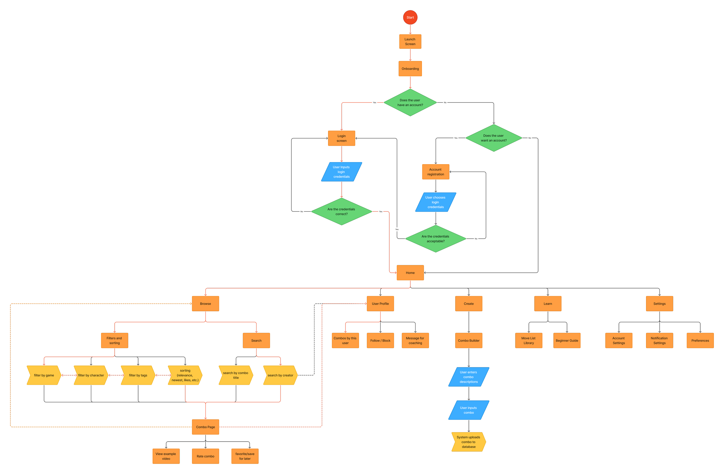
To plan out the structure of the app and how a user might navigate through the screens, I created a user flow chart. This helped me identify key interactions, streamline navigation, and ensure that players could easily find and share combos without friction.
Paper Wireframes
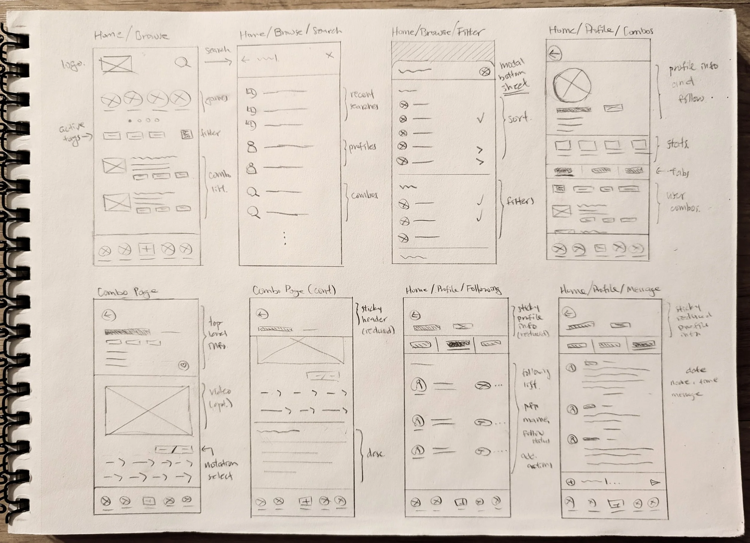
After identifying which screens were needed, I began to quickly explore as many ideas as possible by sketching wireframes on paper. I made sure to explore variations in composition and layout, noting which design choices seemed most intuitive and promising.
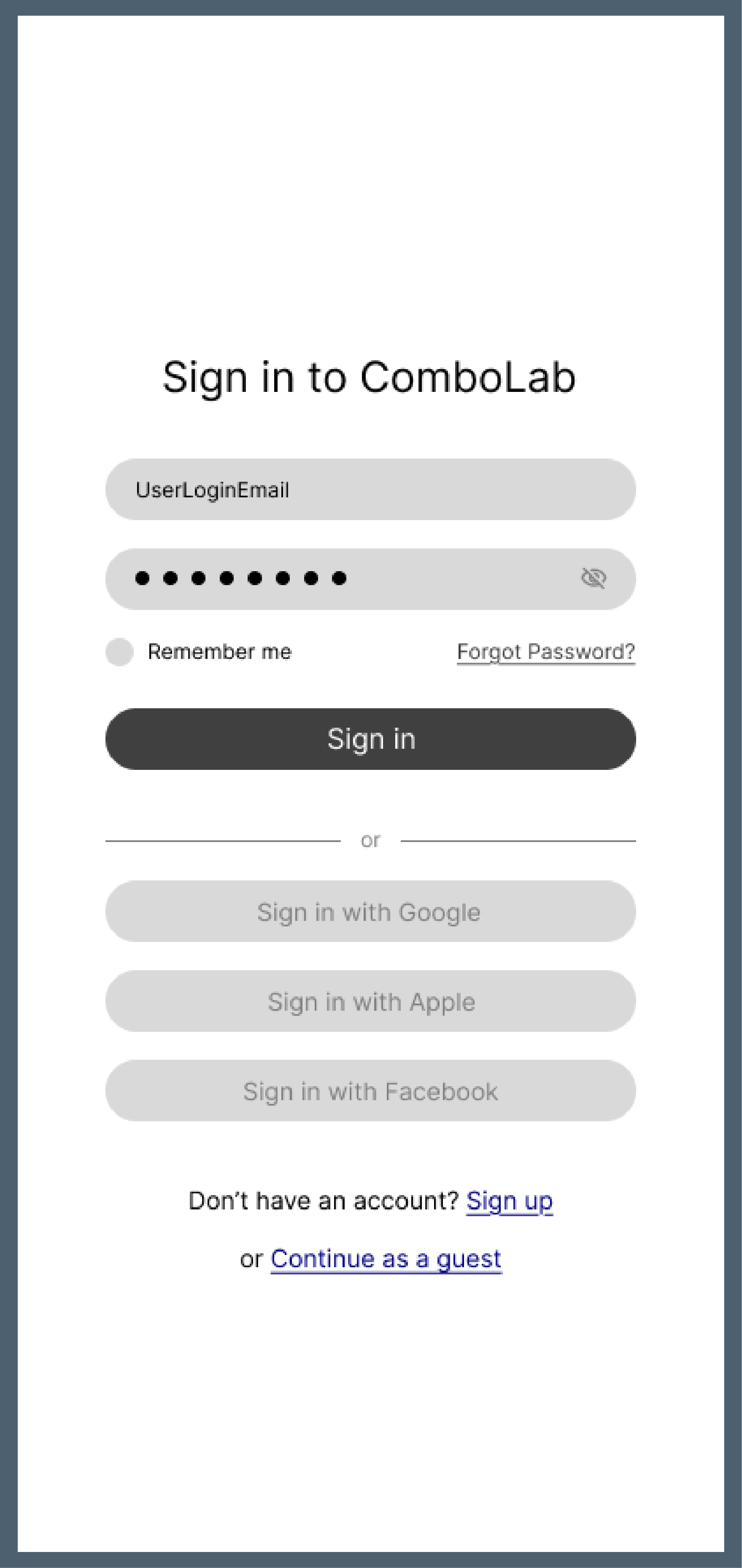
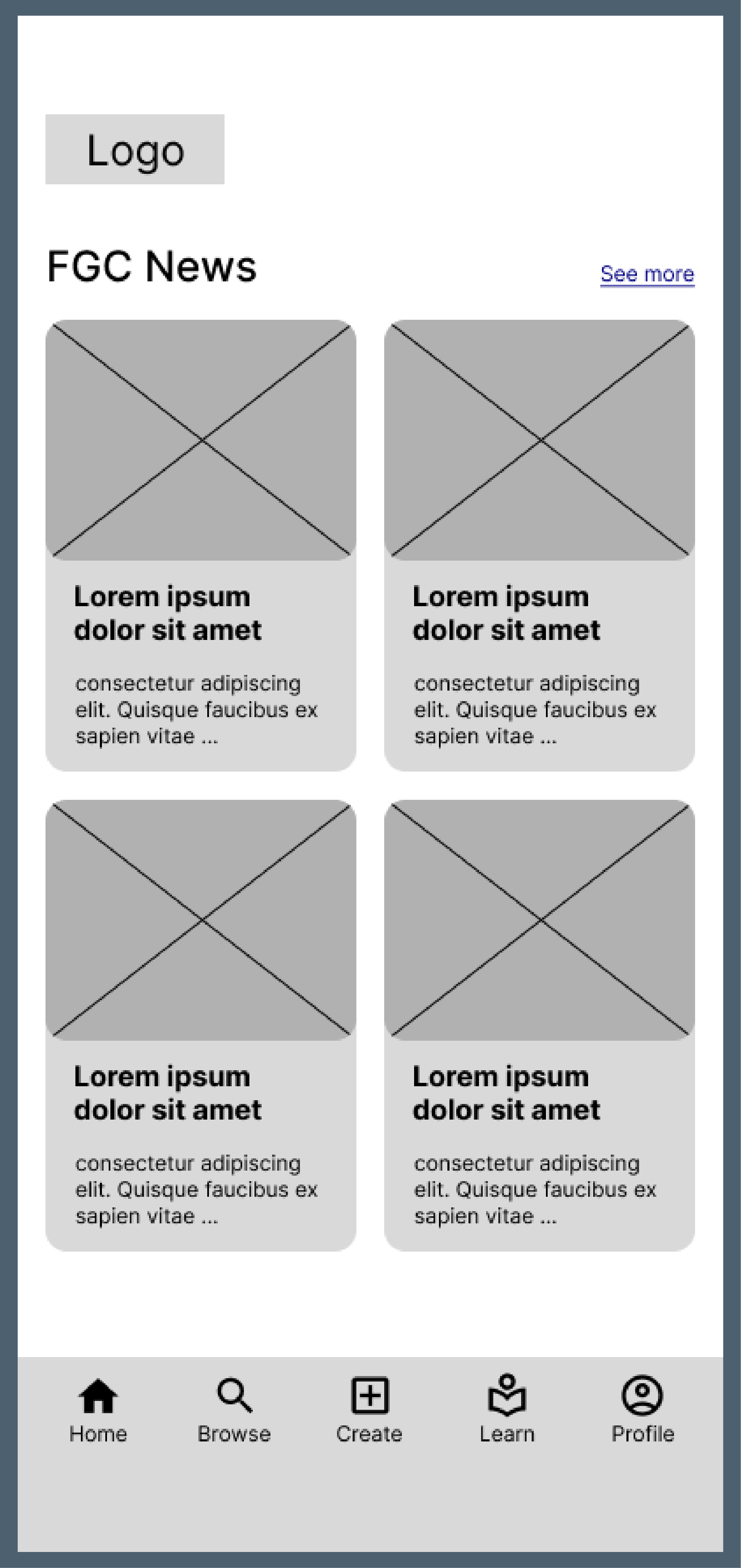
Lo-fi Prototype
To begin gathering feedback early, I turned my paper wireframes into an interactive Figma prototype. This allowed me to share designs with my peers and collect critiques that will inform the rest of the design process.
Usability Study
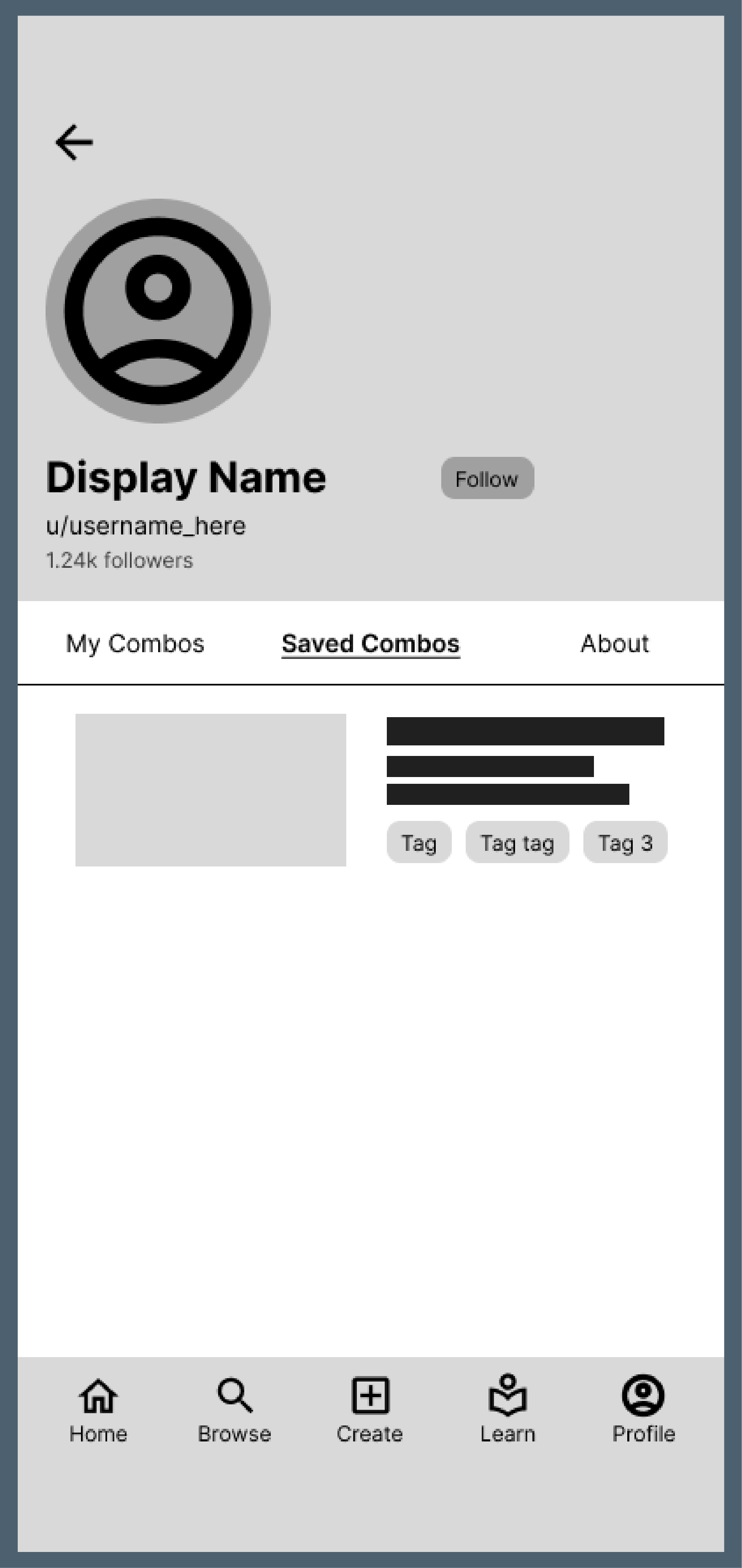
I then conducted a small-scale usability study to test how clear and intuitive the design felt. By asking participants to complete specific tasks and observing how they navigated through the prototype, I identified points of confusion and areas where the experience could be improved.
Context:
ComboLab is an app designed for fighting game players. The app allows users to upload combos they created to a forum for others to view and evaluate.
Task 1:
Find the combo named “Super Cool Test Combo.” The combo is in the game “2XKO” and for the character “Jinx.” After you find this combo, favorite/save this combo for later, and check the comments in this combo page.
Task 2:
From the home screen, navigate to your profile and check how many followers you currently have. Then, find the combo that you save from your profile.
Refinement
Design Exploration
With these insights in mind, I began to iterate on my designs to create a more intuitive and satisfying experience. Throughout this process, I explored not only improvements to screen flow and navigation, but also experimented with color, typography, and layout.
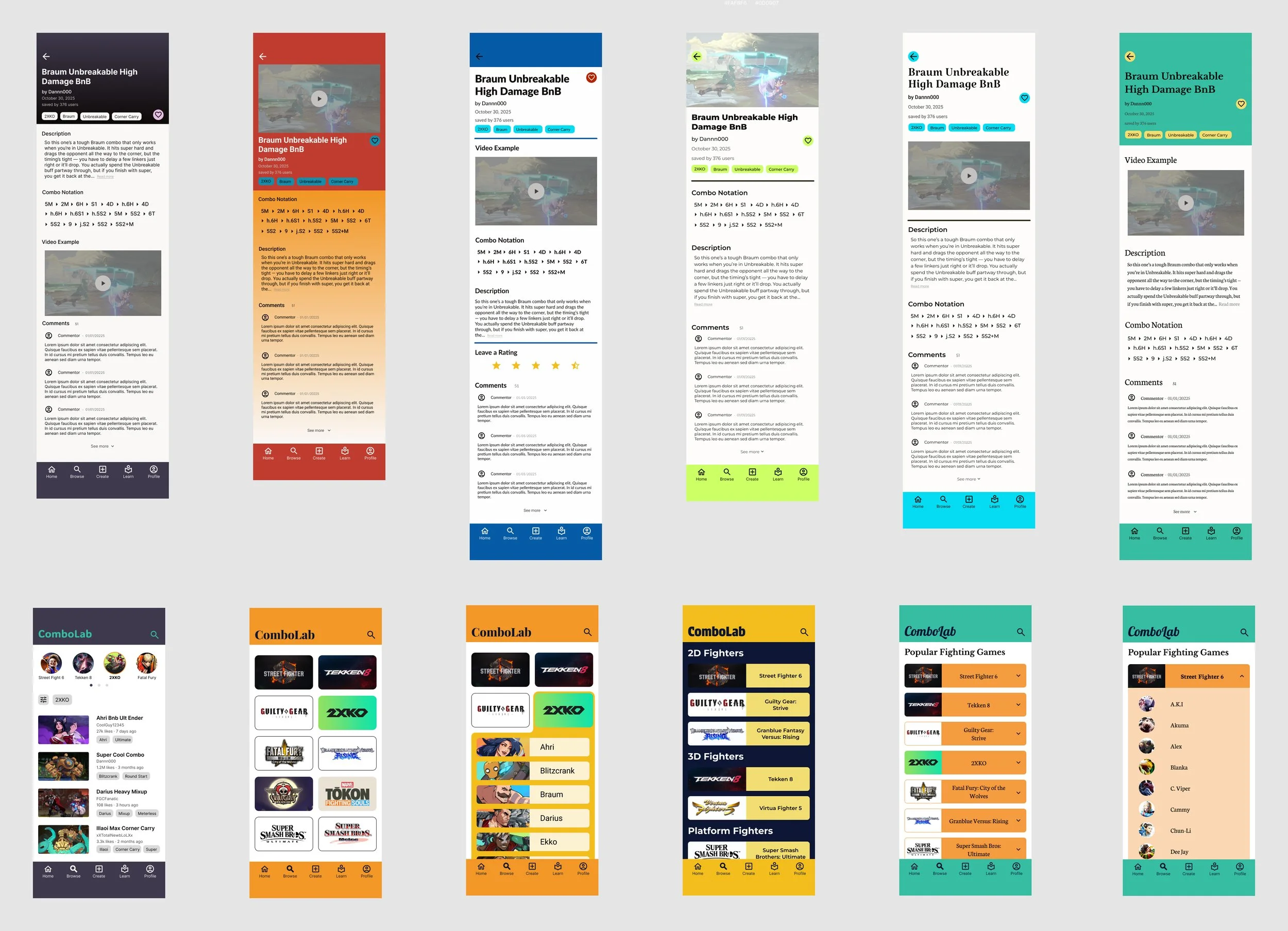
Design Testing
While iterating on my designs, I made sure to frequently gather feedback from my peers and potential users. I particularly enjoyed A/B testing, which quickly revealed which design choices were most effective and provided clarity on which direction I should pursue.
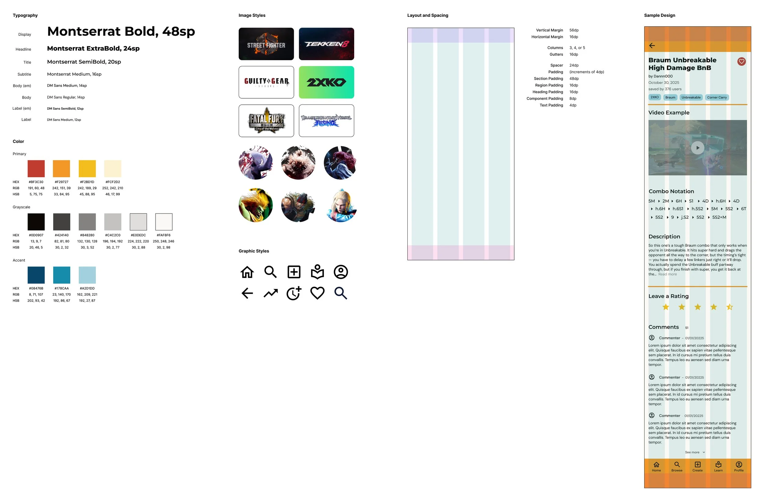
Style Guide
Once I felt confident in the visual direction, I created a style guide to keep track of design decisions and ensure consistency. This helped organize my decisions and made designing new screens much more efficient.
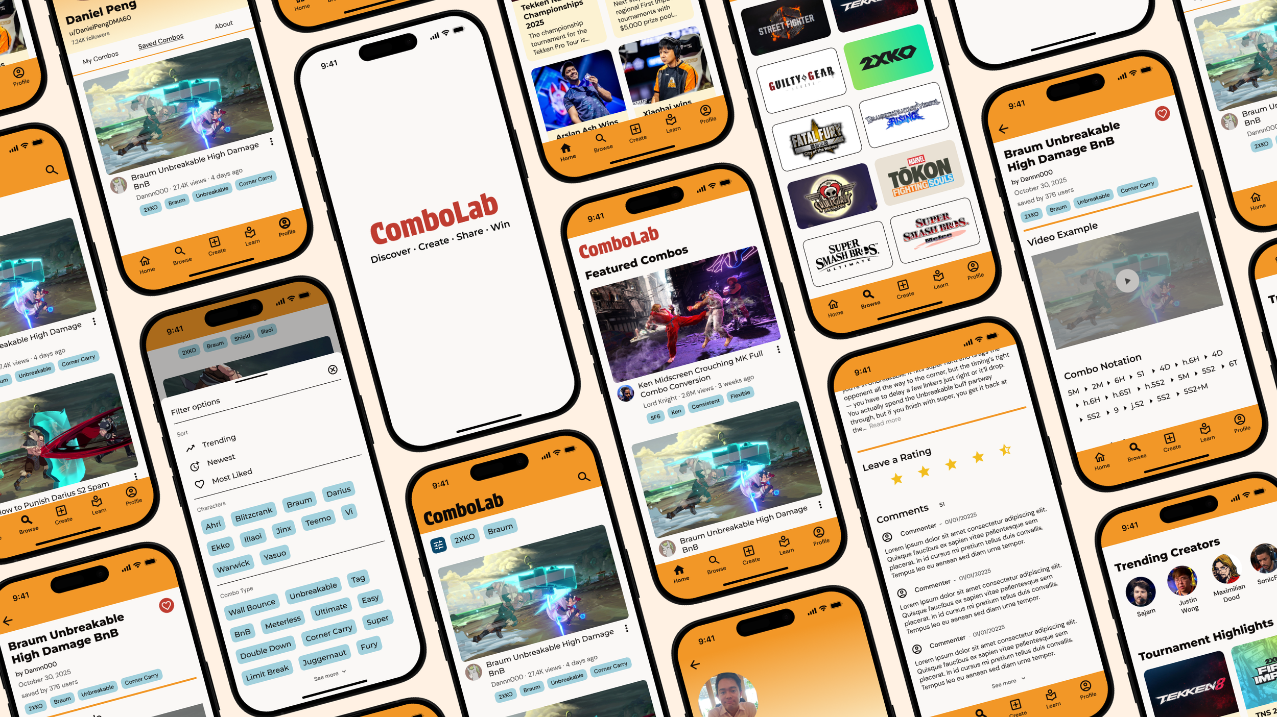
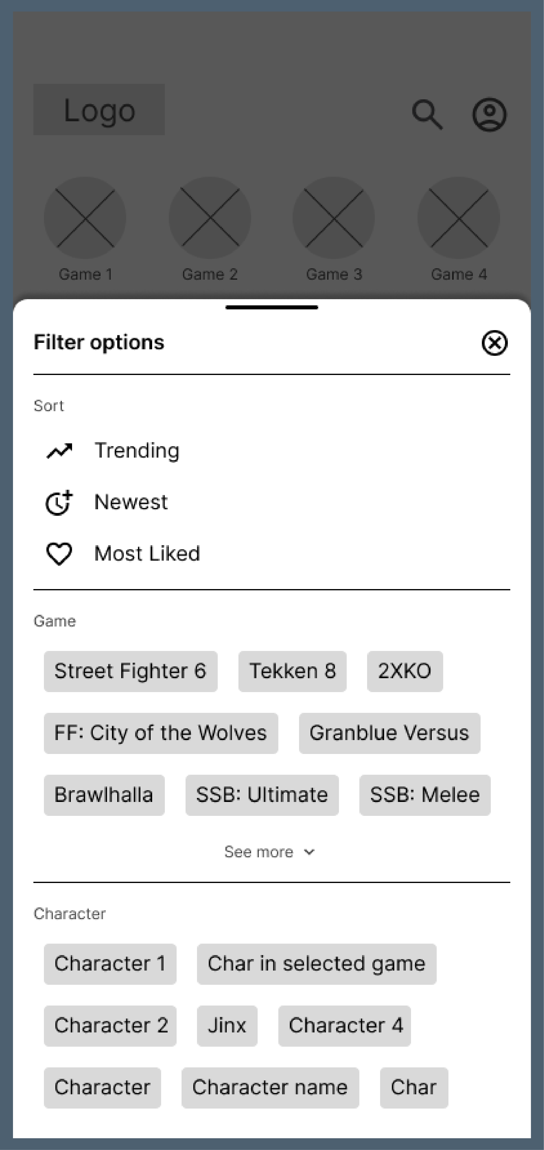
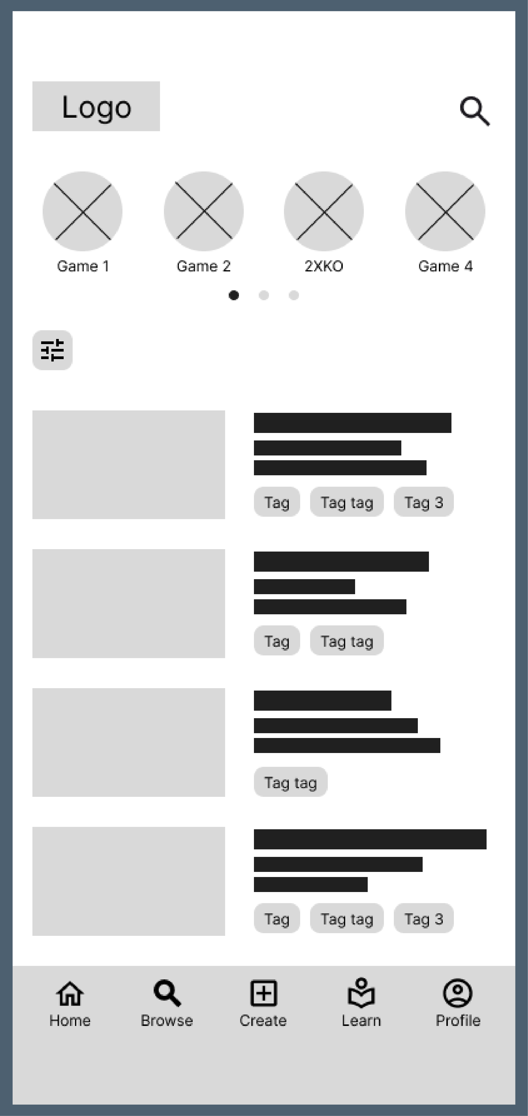
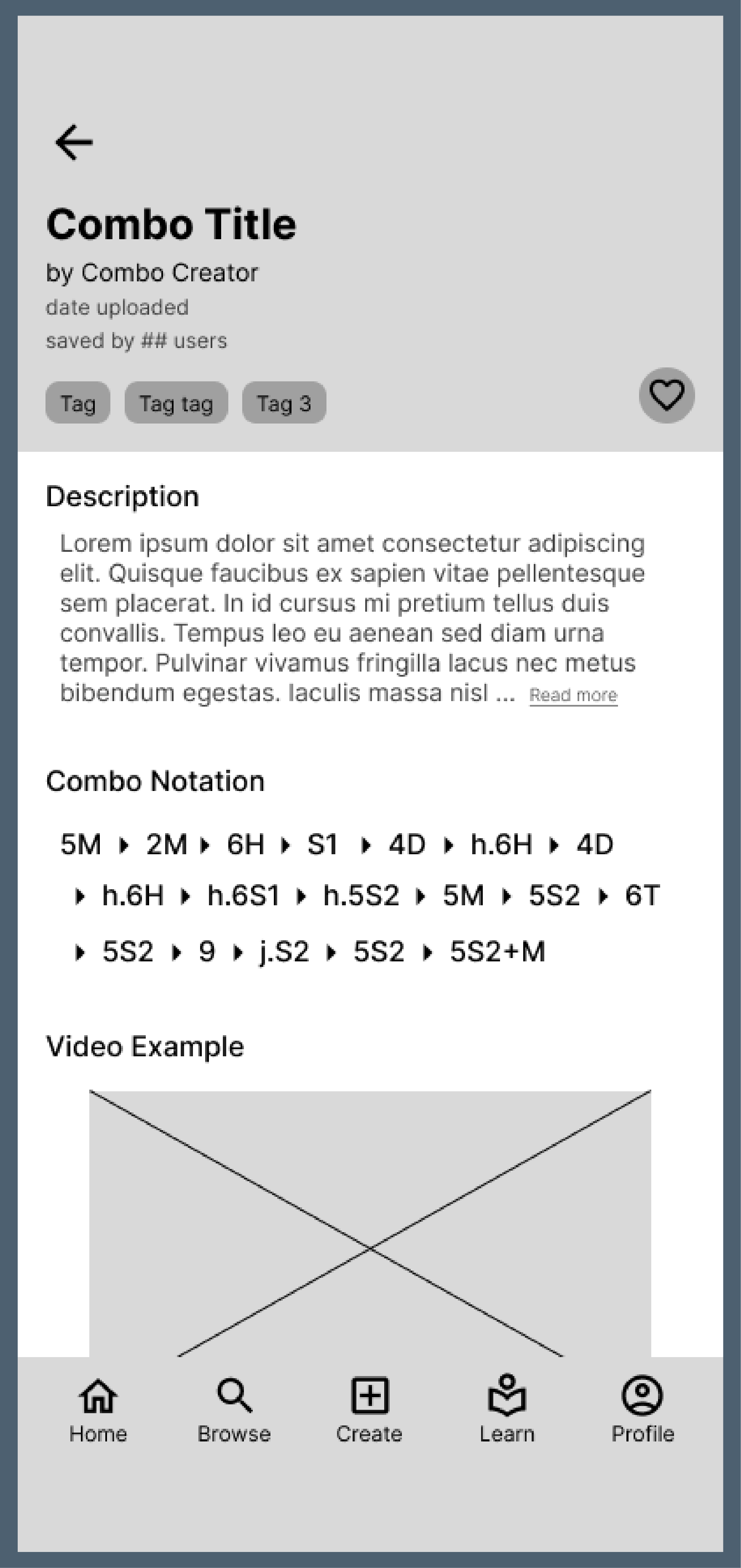
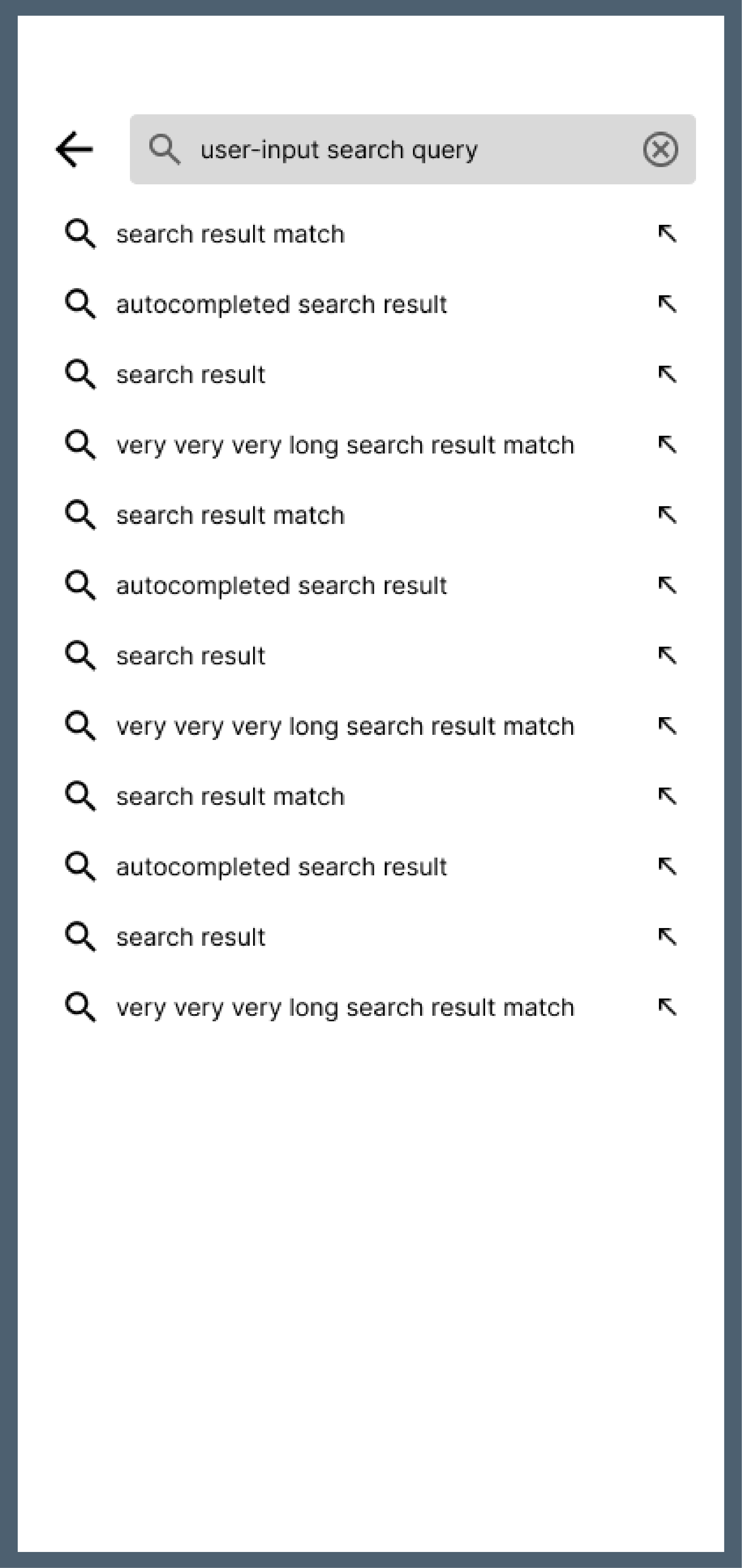
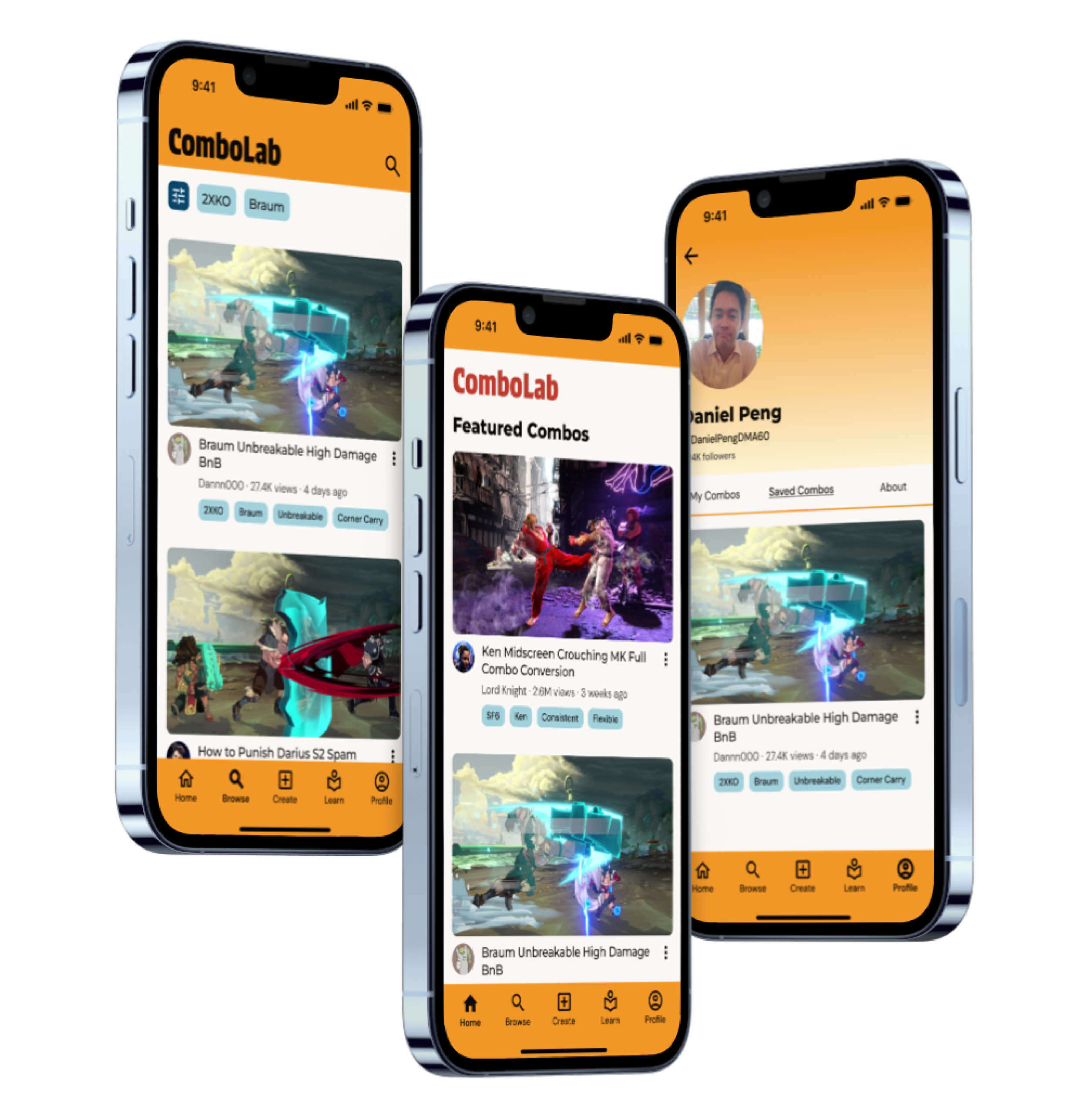
Final Design
Conclusion and Reflection
Overall, this project helped me to better appreciate how important it is to test ideas early and often. Building interactive prototypes in Figma and putting them in front of users in real life allowed me to quickly see what was working and what wasn’t, and pushed me to make more thoughtful design decisions. I also spent a lot of time experimenting with color, typography, and layout, which helped me better understand how these elements work together to create an engaging and cohesive visual experience.
Looking back, there are definitely areas I would like to improve further. Given more time, I would have liked to flesh out screens for the entire app to create a more complete and polished experience. I also think I could have gone deeper in my usability testing by including a wider range of participants and running more structured tests to gather stronger insights.
Thank you for your time. Please reach out if you have any questions!