Twitch Mobile Homepage
Unsolicited redesign of Twitch’s poorly-received new mobile app homepage.
Role: UX Designer, Researcher
Project Overview
Background
Twitch is a live streaming platform primarily focused on gaming, where users can watch, interact with, and broadcast video content. With over 2 million average concurrent viewers, Twitch is the largest streaming platform today, but has started to face increased competition in recent years.
In July 2024, Twitch launched an overhaul of its mobile app in order to attract the growing mobile user base and increase discoverability for creators. The new design has been described as a “TikTok makeover,” featuring a vertical scrolling feed, layout, and navigation nearly identical to those of TikTok. Following its release, the redesign received overwhelming negative reviews from both new and existing users in online forums, social media, and even mainstream news outlets.
To address the many problems with the new mobile app, I redesigned its homepage to give users a more coherent and enjoyable experience.
Problem
Twitch’s redesign presents several problems that can lead to poor user experiences:
Inconsistency. The user experience on the new Twitch app is vastly different from the company’s website. Inconsistent designs across platforms often weaken brand loyalty and user trust.
Lack of brand identity. The new app design borrows heavily from TikTok, with many calling it a “TikTok clone.” The absence of a unique homepage erodes brand recognition and equity.
Underserves primary users. Twitch’s redesign prioritizes improving the creator experience over that of the average viewer. While this accomplishes the company stated purpose of increasing stream discoverability, it is done at the expense of the primary user base.
Inadequate contextual design. Many of the app’s new features fail to consider when and how users interact with the mobile platform, making the app awkward and inconvenient to control.
Poorly complements mobile devices. The app’s forefront vertical scrolling feed of streams poorly utilizes the mobile screen space, leading to a jarring and unappealing visual experience.
Scope
For this case study, I focused on redesigning the app homepage only. Tasks leading to inner pages were considered and rethought using task flows, but the pages themselves were not redesigned.
Solution
I conducted market research, analyzing trends and competitor strategies to identify opportunities for differentiation. I also surveyed user reviews online to gain insight into user behavior and preferences. Using these findings, I designed a new homepage for the Twitch mobile app that can better address user needs and meet business goals. My new design focused on:
Giving control back to the users over the content they curate for themselves
Improving brand identity of the new discovery queue feature
Being more considerate of the users’ context when using the mobile app
Empathize and Define
Competitive Analysis
Starting the design process with a competitive analysis lays the foundation for better understanding industry trends and standards while discovering gaps in the market. Direct and indirect competitors were evaluated and compared against Twitch, focusing primarily on the mobile app experience.

Insights:
Twitch reached a dominant position in the live streaming market during the COVID-19 pandemic through its focus on gaming and community-building. Today, competitors are targeting Twitch’s position by offering creators better discoverability, more favorable revenue splits, and relaxed content guidelines. Twitch’s mobile app redesign attempts to recapture the user base by improving discoverability for creators, but has instead left many existing users dissatisfied, damaging brand trust.
User Reviews
To assess public opinions of the new Twitch mobile app, I followed up by gathering user reviews from various online platforms. Reviews were sampled from a combination of online forums (Reddit, X), traditional news outlets (Forbes, the Verge), and app stores (Google Play Store, iOS App Store).
While I made sure to consider and minimize biases during the sampling process, some were unavoidable due to project restrictions and parameters. For example, the vast majority of reviews for the new app design were negative as users with negative experiences are much more likely to leave reviews. Such cases of sampling bias can be avoided if I am able to perform surveys on live users instead of relying solely on online reviews.
“If I want to navigate to a list of my followed channels that are live, it's an extra button press and there is no way ... to sort that list” - Forbes
“Autoplaying videos are a nightmare for mobile data. Apps autoplaying sound is also a nightmare in general.” - Reddit user
“There’s no where I can easily see all the current live channels or continue watching vods I’ve started” - Google Play Store review
User Pain Points
To analyze the data I just gathered, I created an affinity map to synthesize my research findings. By organizing and rearranging data points into themes, I was able to visually spot key patterns among the many user reviews, revealing common pain points experienced by Twitch’s users.

Insights:
The majority of user complaints revolved around Twitch’s decision to integrate the new discovery queue feature with the list of a user’s followed channels. While many quickly attributed user dissatisfaction solely to the discovery queue, I instead find that existing users have the biggest pain points around the low discoverability/usability of the following list and a lack of control over its contents.
There was also some user feedback on the discovery queue regarding its similarity to the TikTok app and the inconsiderate autoplay feature. These problems can be fixed by adjusting the UI to reinforce Twitch’s brand identity and improving contextual design.
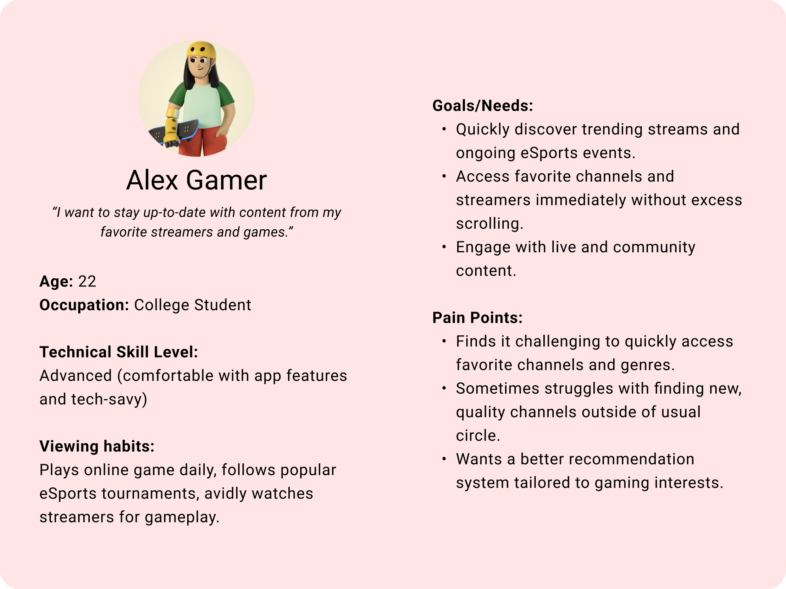
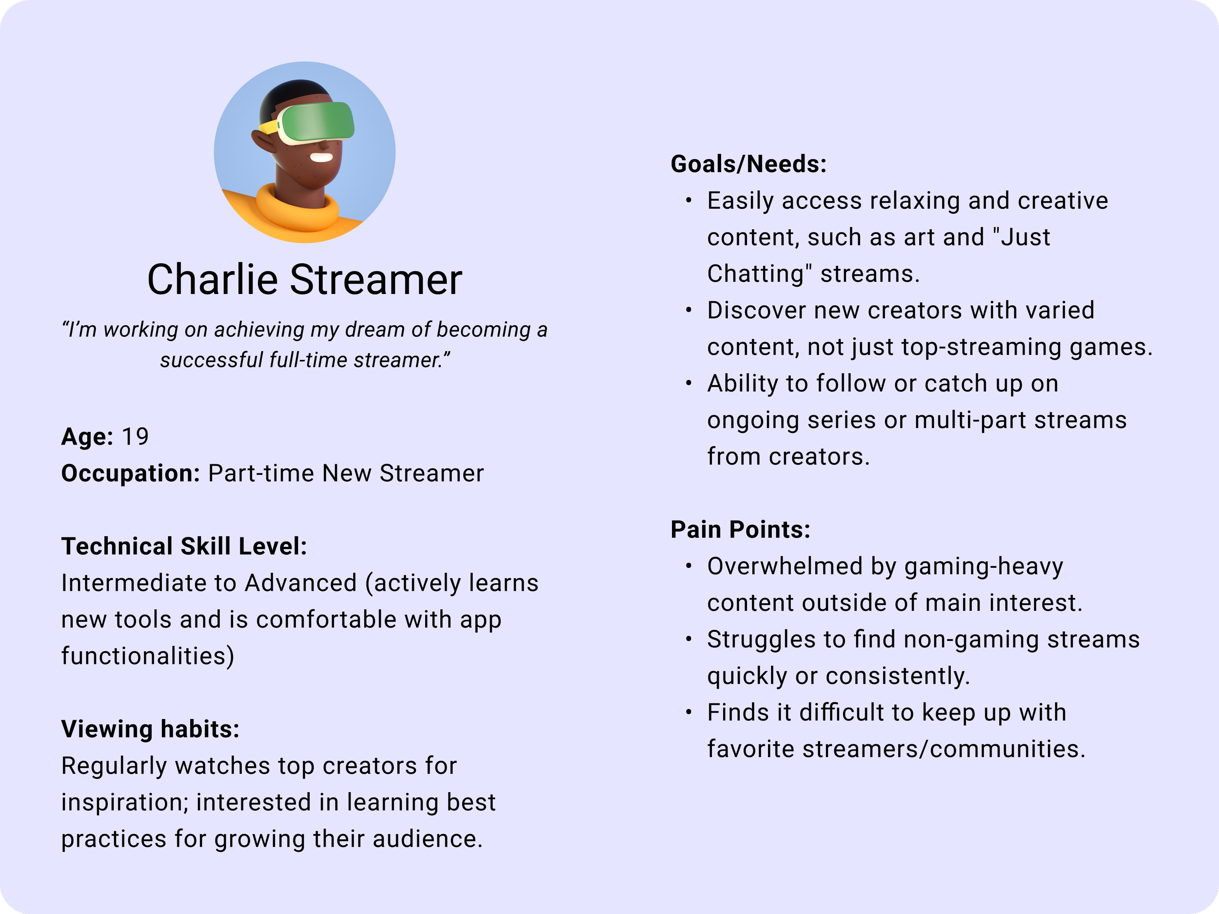
User Personas
Developing user personas is a key step in the design process, helping to solidify understanding of users and ground future design decisions in real user insights. I distilled research findings into three core user personas that represent Twitch’s primary user types: the gaming enthusiast, the casual viewer, and the streamer. Each persona outlines specific goals and frustrations of the audience bloc, allowing me to balance design choices across a range of user needs. These personas were referenced throughout the project, ensuring that the final product would enhance the experience of all users.

Project Goals
Before moving on to ideation, I defined project goals based on the user pain points I identified and listed key performance indicators (KPIs) that can measure progress towards these goals. This step acts as a guide to ensure that the project stays on track as I move forward in the design process.
Specifically, I decided to focus the project on returning agency over the app experience back to the users and improving usability for both the following list and discovery queue. These changes will help existing users regain much-requested control over the content they see while maintaining the business’s goal of boosting content discovery.
Early Ideation
Information Architecture
Before putting pen to paper, I first need to understand all the necessary information on the existing Twitch homepage and its connections to inner pages. I accomplished this by outlining the Twitch app IA to keep track of design requirements and constraints.

User Flow
“Paper” Wireframes
To quickly explore lots of ideas, I digitally sketched a set of low fidelity wireframes for each of the pages listed in the information architecture. I made sure to consider (but not limiting myself to) market trends and research findings when drafting the first round of ideas. I then highlighted the design elements from each version that I’d like to bring to the next round of designs.
A progressive enhancement (bottom-up design) approach was chosen for the project, starting the design process from mobile devices. This was done to optimize the experience of mobile users, who make up the largest portion of website users. The finalized designs will later be adapted to fit larger screen sizes.
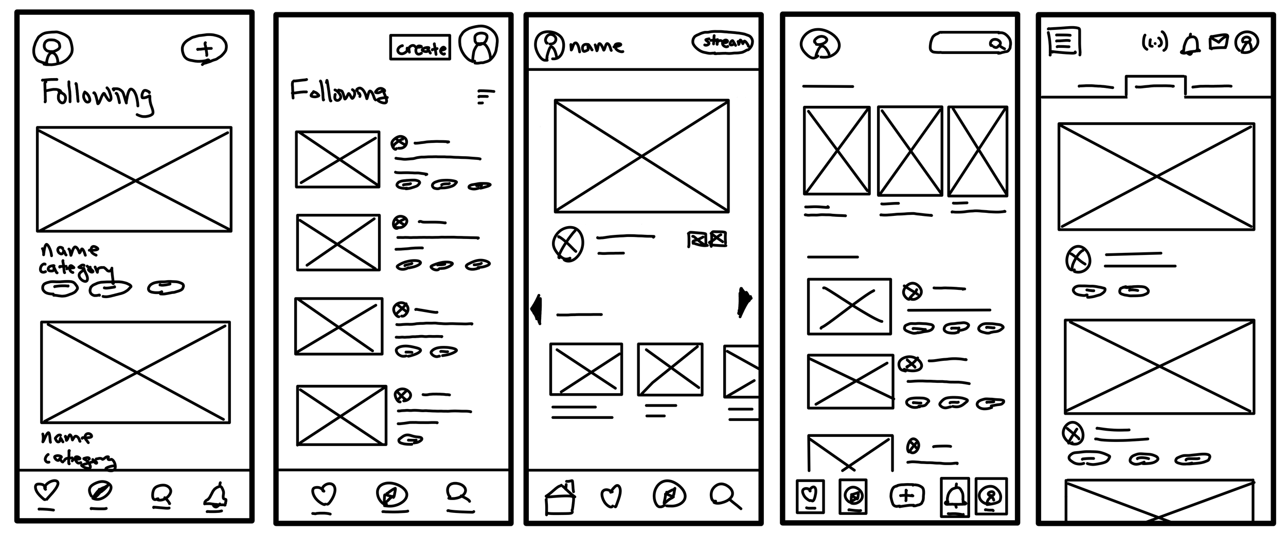
Lo-fi Digital Wireframes
Existing Twitch app IA
Reviewing my research results, I noticed that while most user complaints revolved around the new vertical streams feed, the actual pain point lies in users’ lack of control over browsing channels and categories they follow. To better meet user needs, I iterated on the IA, separating the “Following” list from the new discovery queue feature. This change aims to directly address our primary user base’s pain point while retaining Twitch’s goal of boosting stream discoverability.

Redesigned Twitch app IA
I consolidated the best ideas into a set of low-fidelity digital wireframes, then added functionality for early prototyping.
Refinement and Prototyping
Style Guide
Before I moved to the high-fidelity designs, I wanted to create a style guide that would aid me during the design process and to ensure consistency throughout the product. Since no previous branding materials or guidelines were available to me for this project, I had to start from scratch.

The color palette was created from the colors on the flag of Thailand, adjusted slightly to ensure sufficient contrast in accordance with the Web Content Accessibility Guidelines. Montague Slab was chosen as the typeface for its above average width and x-height for legibility.
Hi-fi Mockups and Prototyping
Using the style guide as a reference, I created mockups based on the lo-fi wireframes and feedback from stakeholders. To best match the desired look and feel of the final product, I wrote all the necessary copy for the website and populated the site with a combination of images taken at the restaurant and placeholder stock photos. To prepare for testing, I then added interactivity to the mockups to create a functional prototype of the design.

Usability Study
To evaluate whether design goals have been achieved, the same 5 participants from the earlier user interviews were invited back to participate in a usability study. A combination of in-person and Zoom interviews were conducted, where participants were asked to perform a series of tasks using the hi-fi prototype. Metrics such as completion rate, time-on-task, and error rates were collected during the study, and participants were asked to rate and explain their experience with the tasks.
Task #1 :
From the homepage, locate the address, hours, and contact information for the restaurant.
How would you rate the difficulty of finding this information? (1 = very difficult, 10 = very easy)
Task #2 :
Navigate to the “About Us” section of the webpage. From there, start the process of placing an online order.
How would you rate the difficulty of navigating to the “About Us” section of the website? (1 = very difficult, 10 = very easy)
How would you rate the difficulty of starting an online order from the “About Us” section? (1 = very difficult, 10 = very easy)
Interview Questions:
Overall, how would you rate the difficulty of reading the various texts on the website? (1 = very difficult, 10 = very easy)
Describe your experience with the amount and use of images throughout the website.
You can navigate to the “About Us” section of the website through a button on the homepage or through the navigation menu on the top right of the screen. Which method did you prefer? Why?
How likely are you to visit the restaurant in-person? How likely are you to place an online order from the website? (1 = very unlikely, 10 = very likely)
Research Results and Insights
Overall, the usability study was very successful and informative. Each participant was able to complete the simulated tasks without intervention, showing that the navigation solutions for the website is viable across potential users. Testing also revealed areas where this design still falls short, which would be resolved in the next round of design.
Research Insights
Navigation is viable across different users
5/5 users were able to complete tasks without intervention.
Participants used both the homepage buttons and hamburger menu for navigation.
Primary call to action was clear and effective
Average time to click “Order Online” button from the homepage after being prompted was 11 seconds.
“Yeah [the task] was very easy, the button is very obvious.”
Users appreciate seeing recommended menu items, but found the lengthy menu overwhelming
“I liked seeing the popular dishes with big pictures. It makes deciding what to eat very easy.”
“Opening the menu for the first time was kind of scary since it’s so long.”
Most users responded positively to the abundant use of images throughout the website
4/5 users were happy about with the use of images. The last user thought the gallery section was “a bit busy.”
“Seeing pictures of the restaurant makes me feel welcomed to go eat there.”
Some users found text on the website to be too long and hard to read
2/5 users reported difficulties reading small text, especially when light-colored text appeared on dark backgrounds.
1/5 users felt that come copy on the website were too lengthy
Opportunities
Featured discounts and deals would further entice customers
Information about catering should be available
Images in the gallery should be better organized to avoid confusion
Button to return to the homepage should be more obvious
The Solution
Final Disign
I made further refinements on the mobile prototypes based on the feedback and insights from the usability study. This includes improvements to both the text legibility and the navigation UI for the website. I made sure to refer to user personas and stakeholder feedback during this last round of iteration in order to ensure both user and business needs are met.
To round out the progressive enhancement design process, I adapted the mobile designs to fit larger screen sizes. In particular, ensuring a good desktop experience was the focus at this stage as these make up the second largest portion of site visitors.

Conclusion and Reflection
This project was full of firsts, and I was able to learn so much by following the design process from beginning to end.
The most challenging part of the experience was leading the entire design process as a solo UX designer. I had to learn to juggle between conducting research, designing/prototyping, and communicating with stakeholders. Additionally, working on a real project taught me the importance of considering both the needs of the business and the needs of the users, which really broadened my perspective as a designer.
If I had more time and resources, I would conduct an additional round of usability study earlier in the design process to better inform the second iteration of designs. However, the limitations allowed me to hone my ability to make the most of what I’ve got, and made the overall experience all the more fulfilling.
Thank you for your time in reviewing this case study. Please feel free to reach out to me for more details about this project or if you have any questions about my design process.