Typographic Poster
Graphic Design , Typography
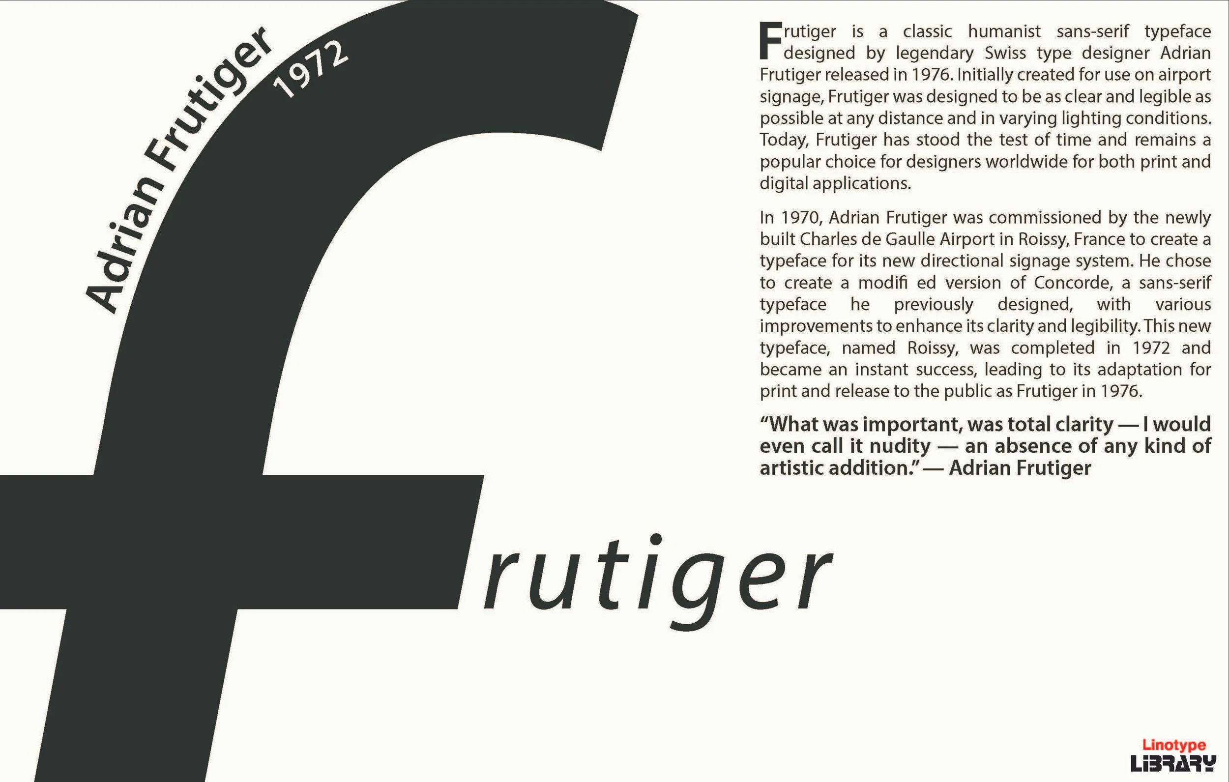
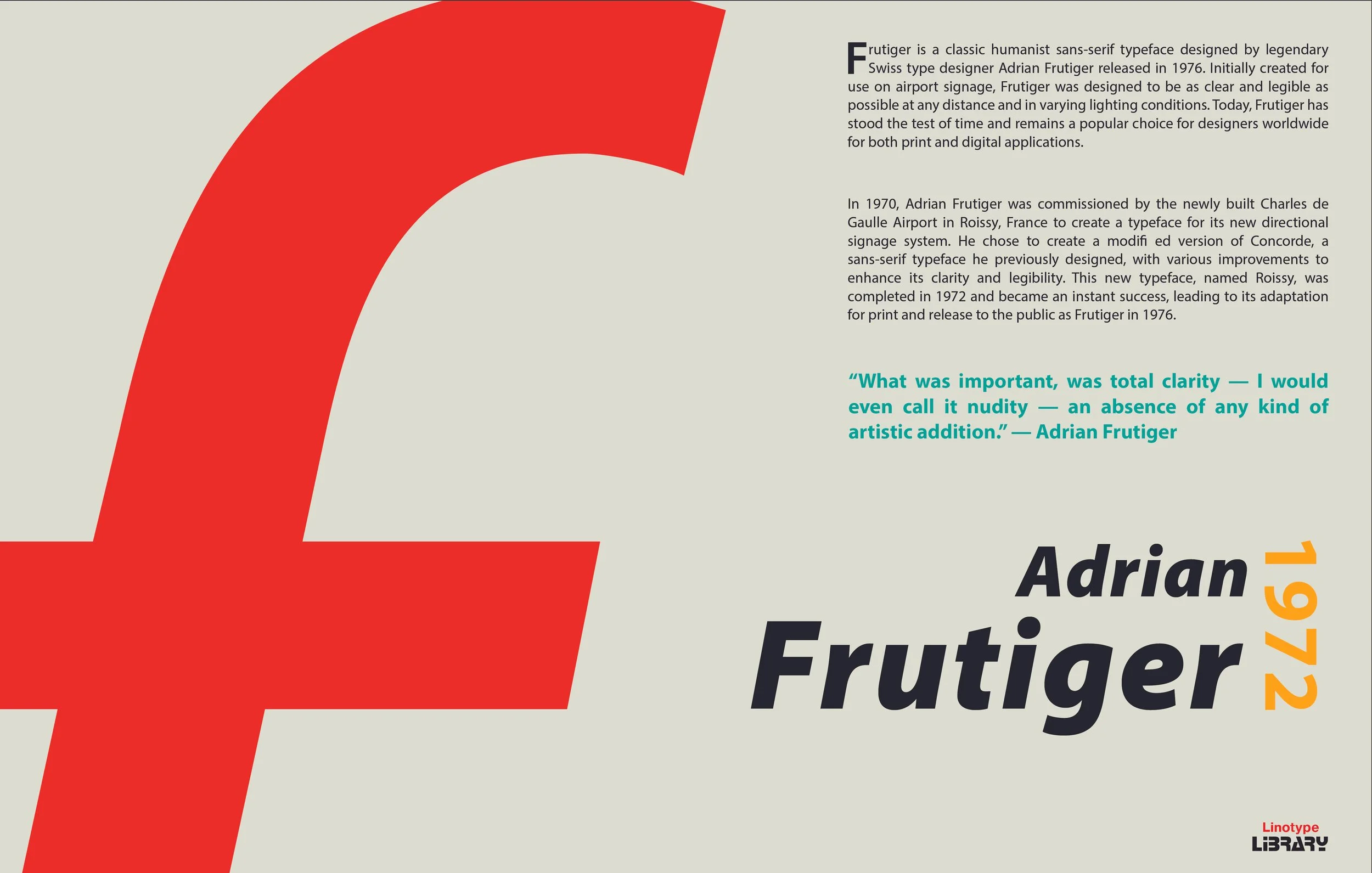
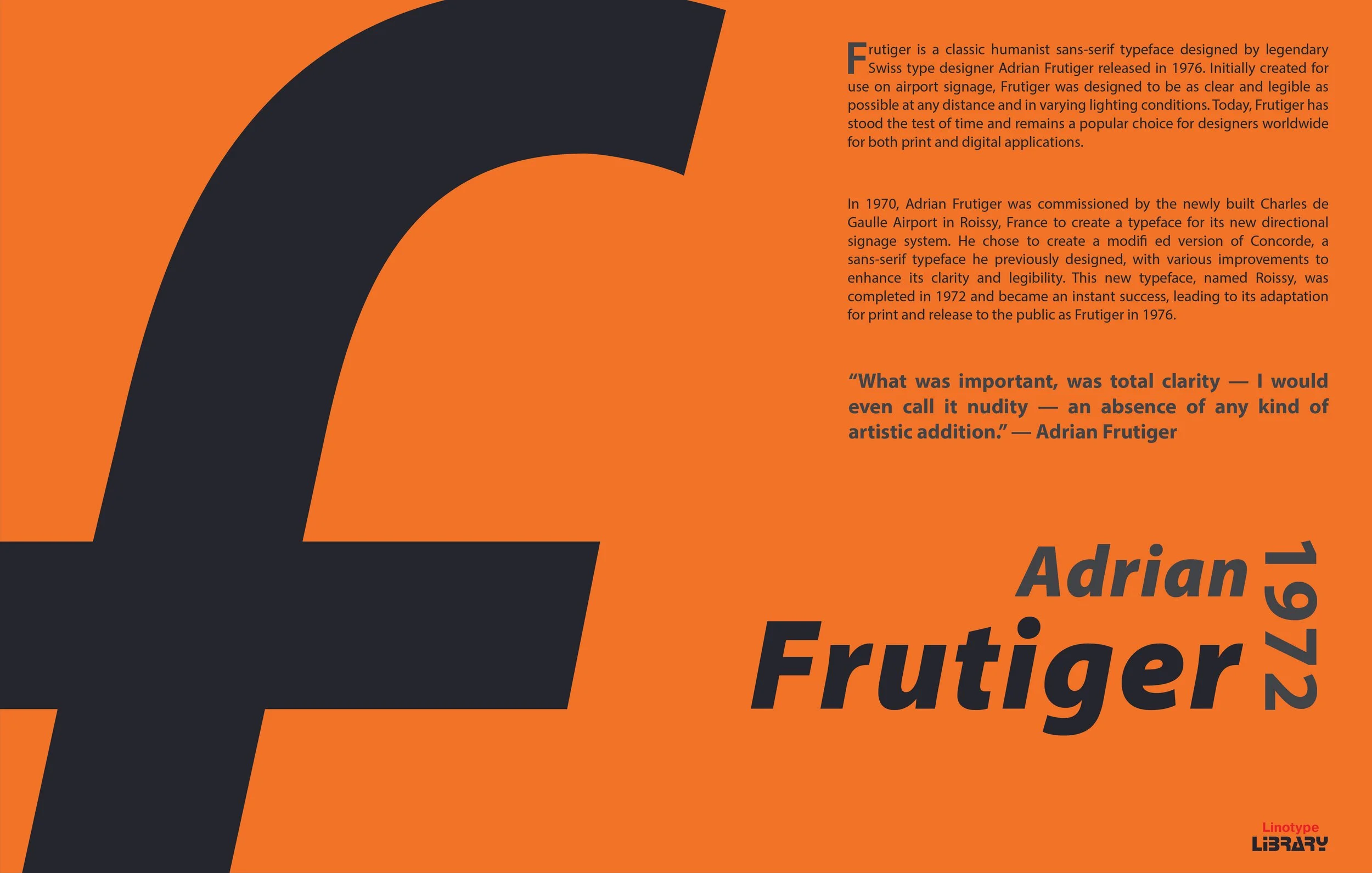
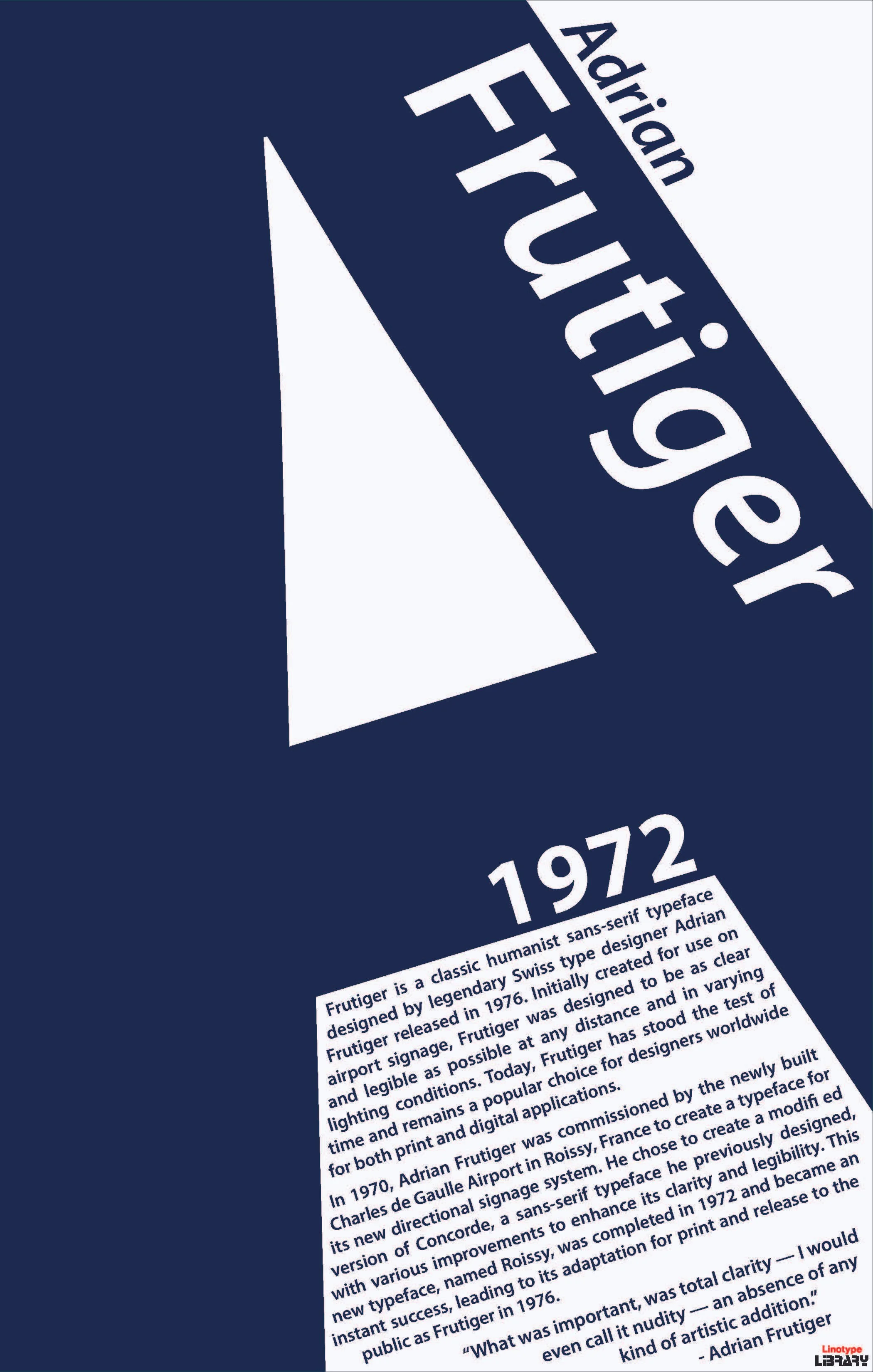
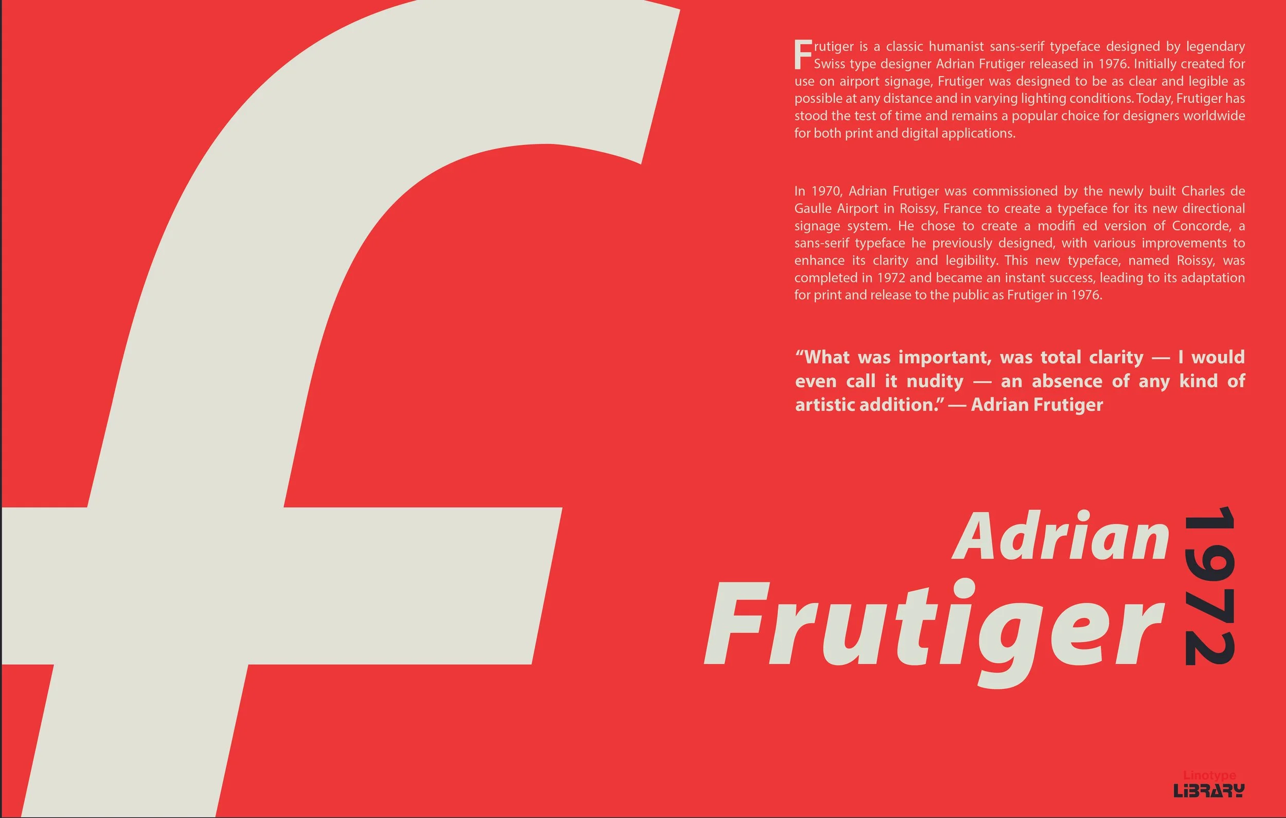
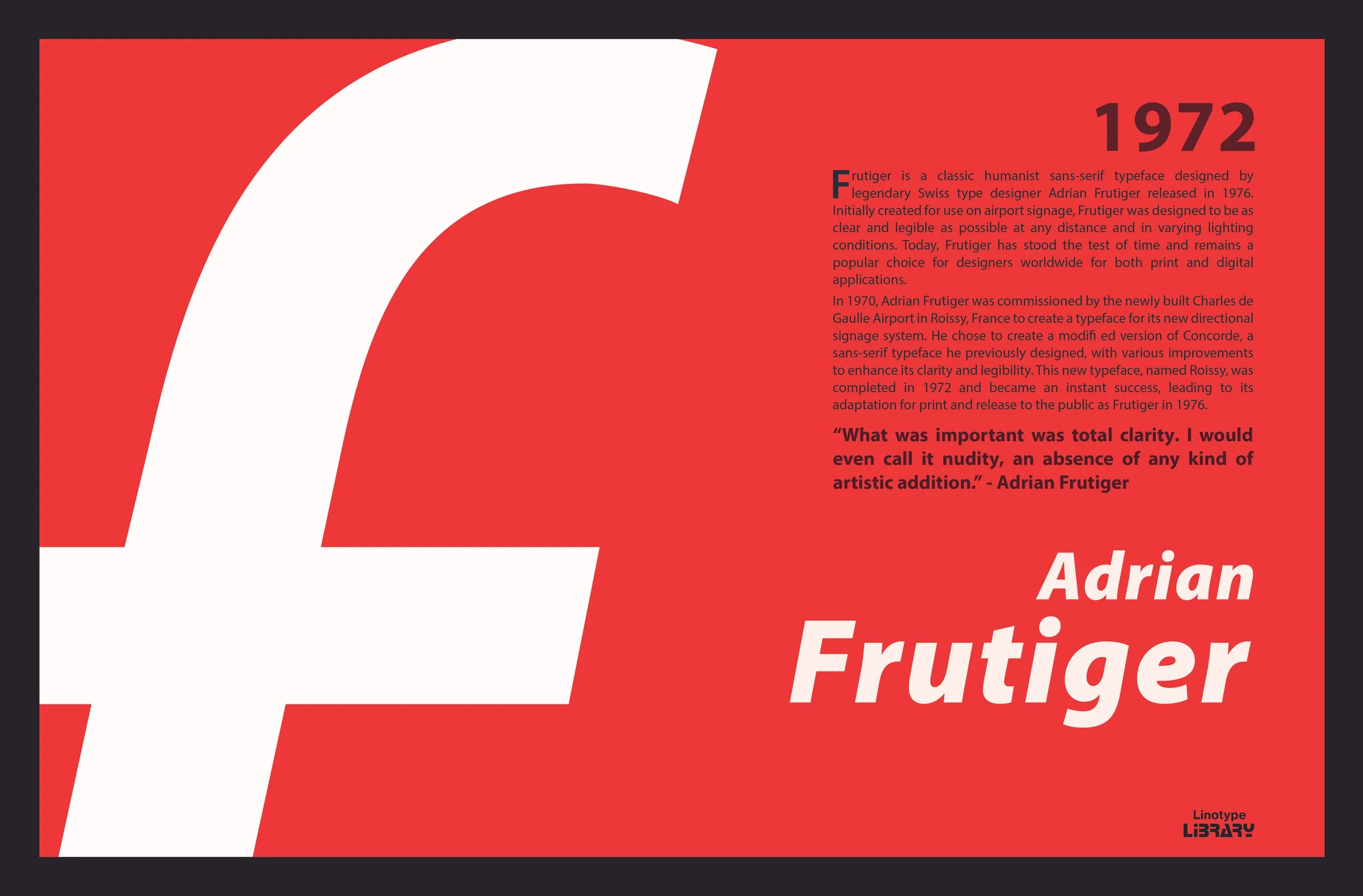
Thinking about typography as more than just text. Designing a poster to promote legendary type designer Adrian Frutiger and his classic namesake typeface Frutiger.

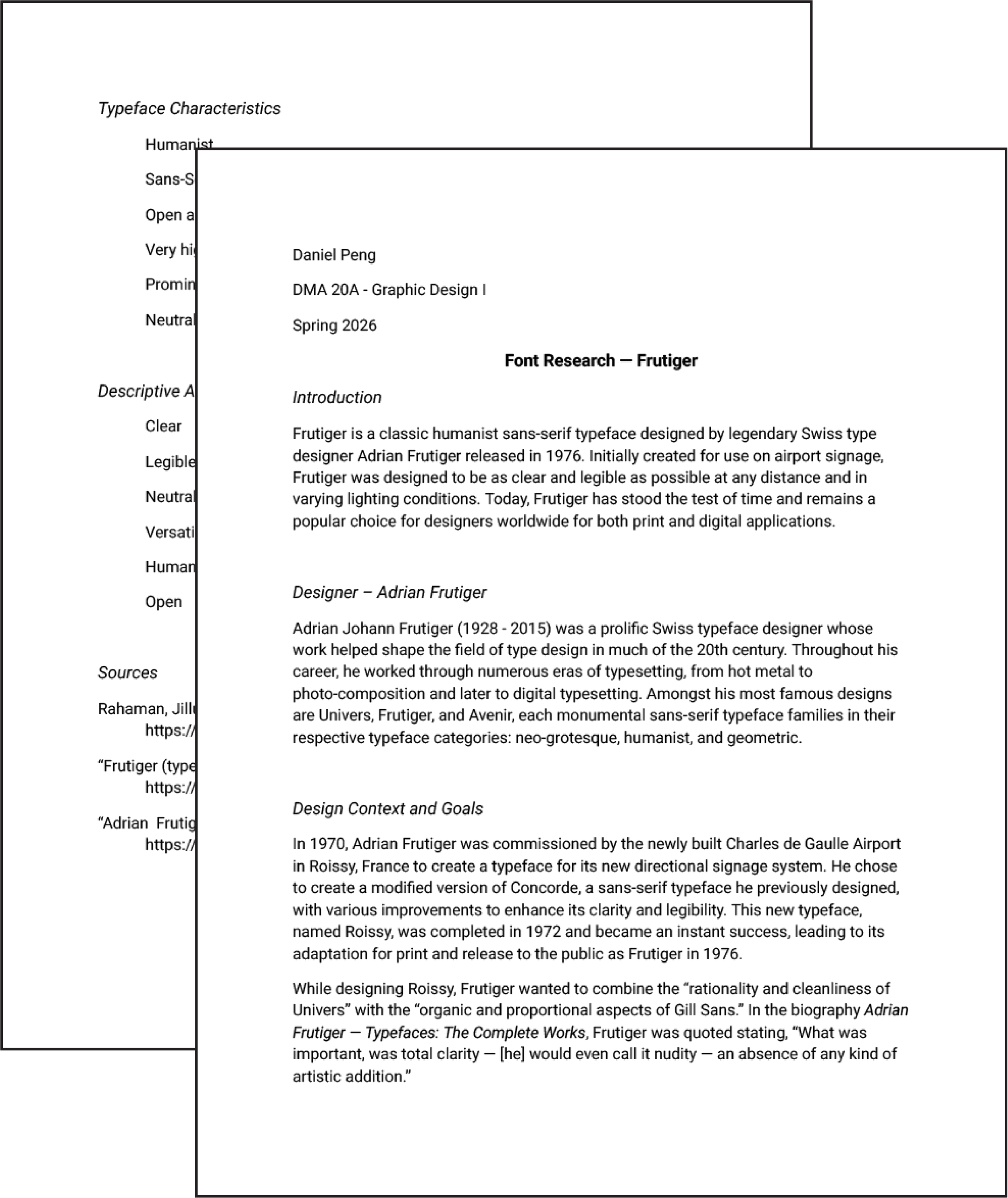
Research
Good design cannot happen without good research.
By learning as much as possible about Adrian Frutiger and his work, I was able to continue with the design process confident that I can accurately showcase the core essence of this typeface.
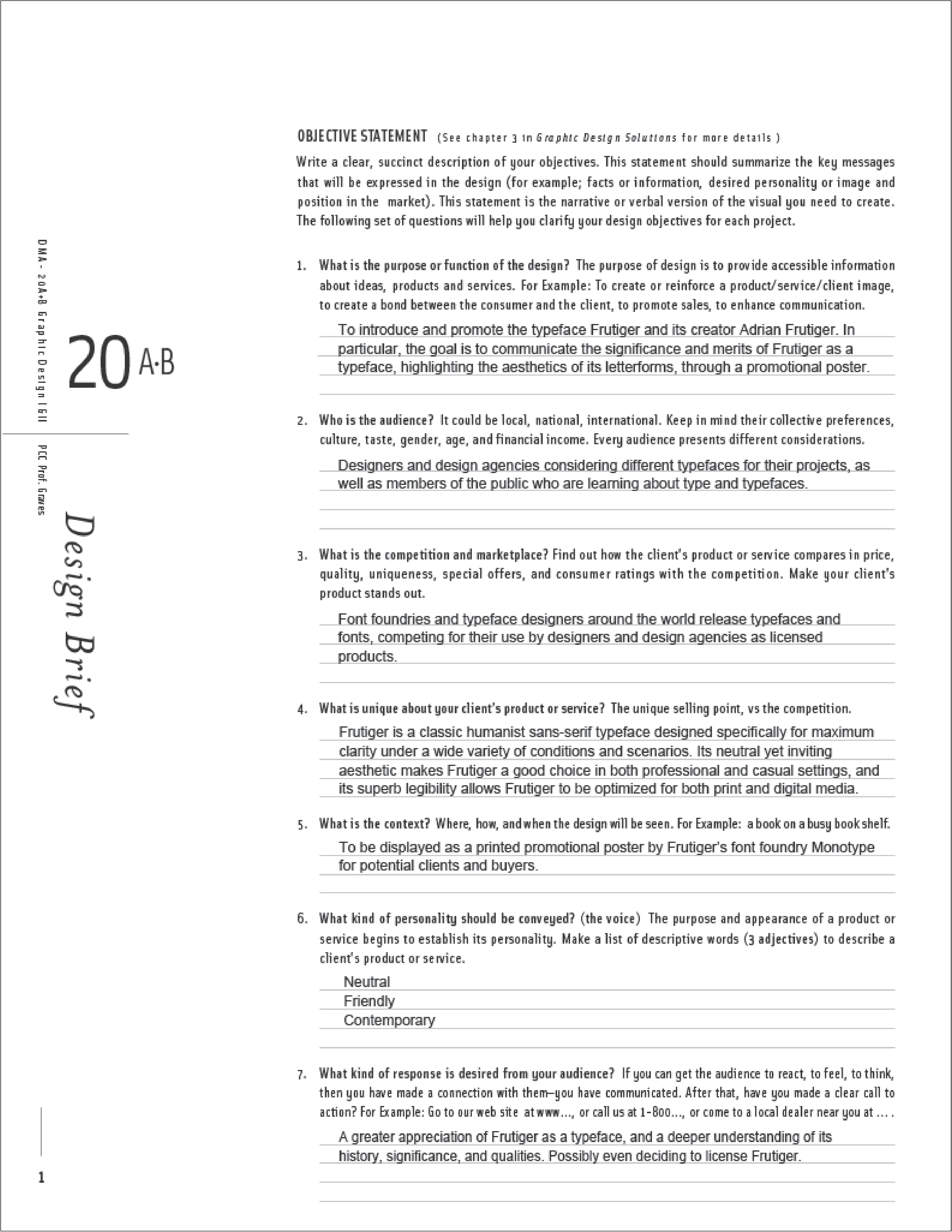
Strategy
Before I began ideating, I needed to clearly define my project goals and parameters.
I specified my design’s function, intended audience, competition, value proposition, and context in an objective statement. The goal became clear: to portray Frutiger as neutral, friendly, and contemporary typeface suitable for a wide variety of design applications.
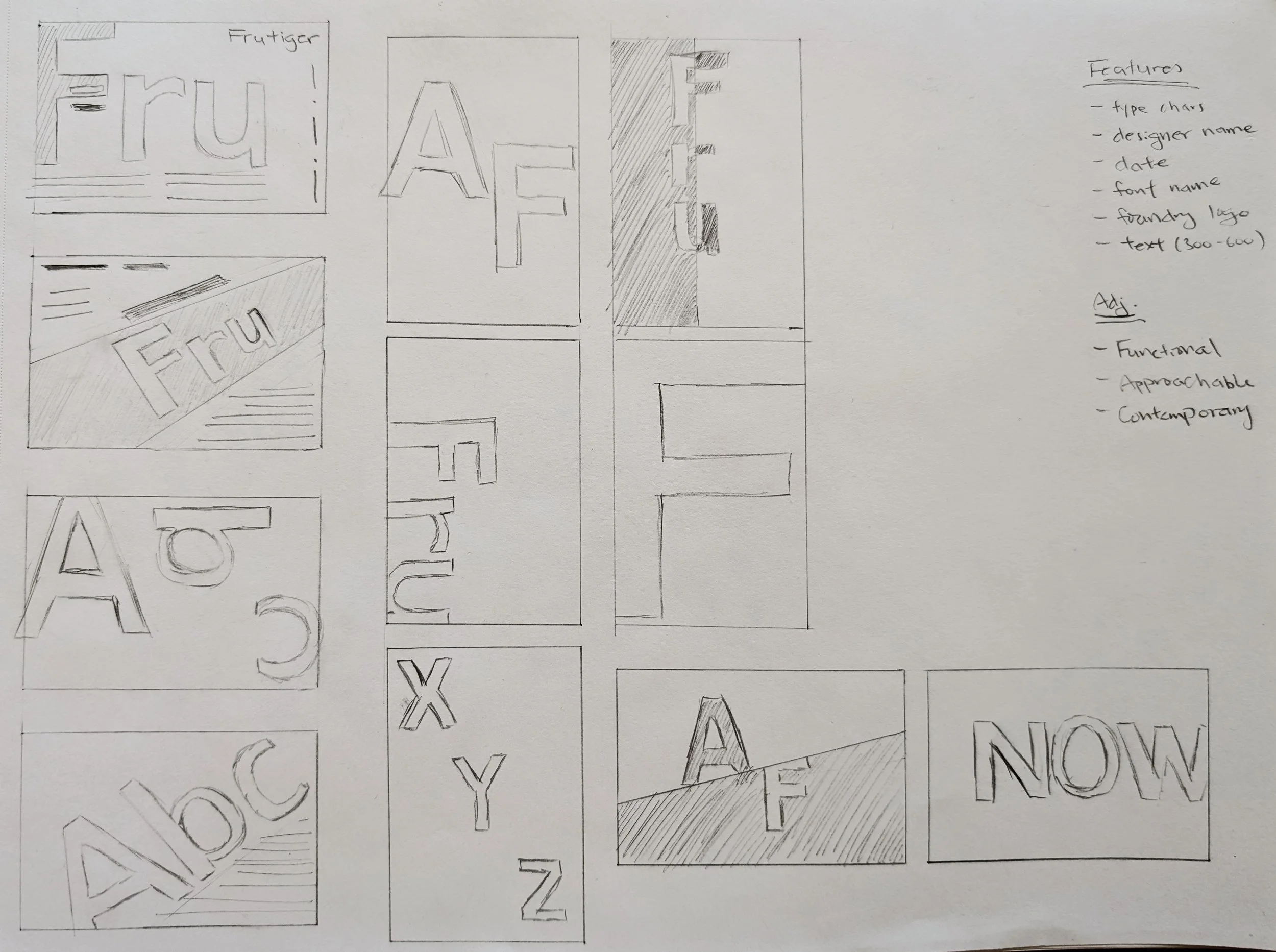
Concepts
I began to ideate by quickly generating visual concepts for my poster. At this stage, I made sure to try out a wide variety of visual styles and layouts while staying within the parameters laid out in my objective statement.
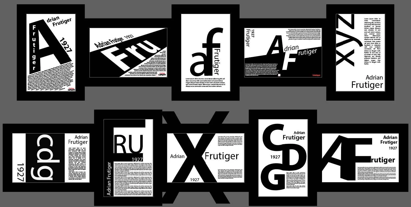
Refinement
I then took my best concepts and began to refine them.
I made sure to frequently seek feedback and critique from others, which helped me to identify weak points and make more intentional design decisions. With each iteration, my poster became more cohesive and focused, with clearer visual hierarchy and stronger composition.
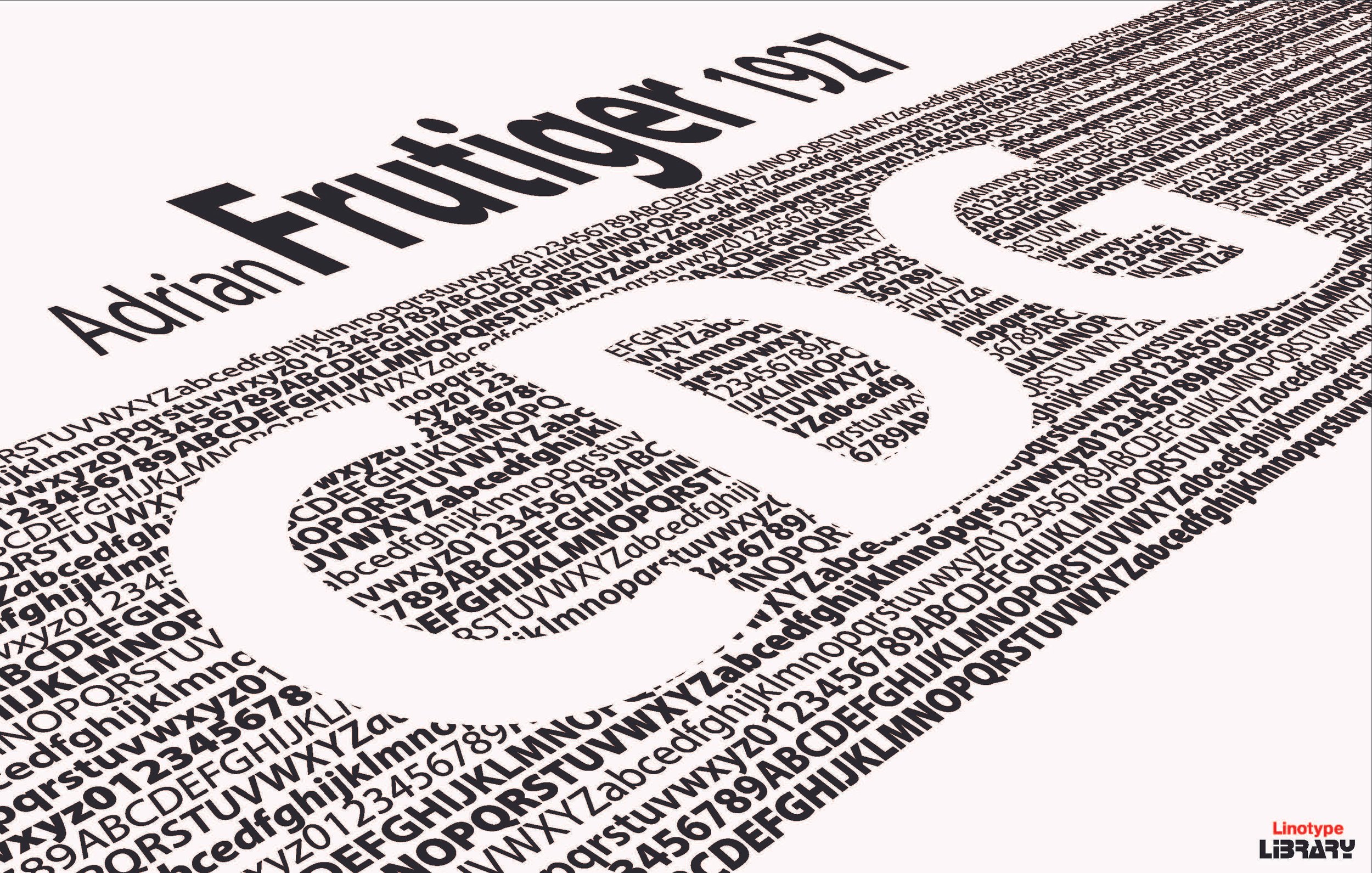
(early concept refinement)
(color exploration and layout adjustments)
Final Design
Reflection
This project challenged me to think about typography as more than just text, but as a fundamental visual element that could convey meaning and structure on its own. Limiting myself to typography pushed me to expand how I use color and layout to create visual hierarchy, helping me grow as a visual designer and create more clear and engaging compositions.